US 1Q16 GDP (second release): the good and the bad

Posted on May 27th, 2016

Main takeaways:

The good:
  • Overall 2% yoy growth is good given the headwinds the energy sector, strong dollar and tighter financial conditions in 2015.
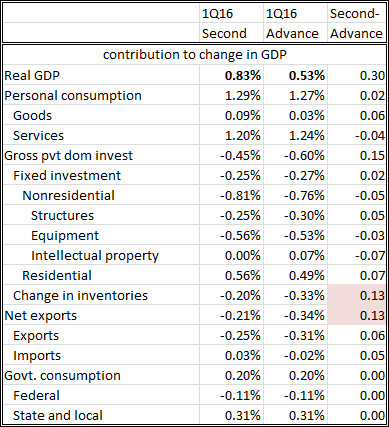
  • 1Q GDP revised up three tenths to 0.8%.
  • First released of real GDI at a strong 2.2% and 4Q15 was revised up by 1 percentage point to 1.9%.
  • Adjusting for 'residual' seasonality would lead to a materially higher growth in 1Q (2.4%), more in line with the income report (GDI).
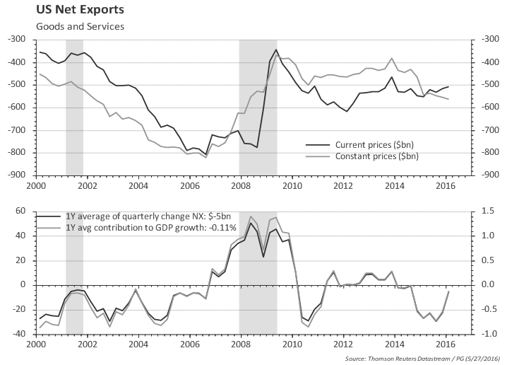
  • Net exports appear to be improving, after subtracting more than 0.5 percentage points from 2015 growth.
  • Residential investment is performing quite well.

The bad:
  • Growth in 2Q15 was 3.9% so there is a high hurdle for keeping annual GDP at 2%.
  • ISM suggest the inventory cycle is not complete. Change in inventories will likely to continue subtracting from growth.
  • Household consumption slowed down materially (but there's some hope it will rebound, based on the latest retail sales report).
  • Non-energy related investment slowed down substantially in the last two quarters. Is the energy crisis spreading to other sectors ? Most recent durable goods report does not show any substantial improvement in capex.
  • Discretionary spending slowed down in the last few quarters, and this often is a bad omen for future growth.


Outline of the rest of the report:
- GDP second release vs. advance
- GDP vs. GDI
- GDP Plus
- Discretionary spending
- 'Residual' seasonality
- Inventory cycle
- Chart pack -- full details


GDP second release

First quarter GDP revised up three tenths to 0.8%; first release of real GDI at a strong 2.2% and real GDI for the 4Q15 was revised up by 1 percentage point to 1.9%.
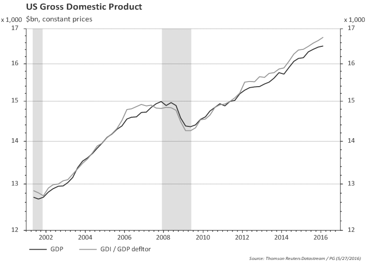


GDP and GDI

Both measures -- Gross Domestic Product and Gross Domestic Income -- should be equal (income = expenditure) but the data sources used to produce them are different and there is no effort to reconcile them, thus both contain valuable information. GDP uses the final expenditure approach and GDI is measured using the income approach. GDI is not available at the time of GDP's advance release and often gets relegated to a secondary role, although some researchers point to GDI as a better gauge of the economy (e.g., Nalewaik, J.J. (2010), “The Income- and Expenditure-Side Estimates of U.S. Output Growth," Brookings Papers on Economic Activity, 1, 71–127).

The chart below plots both GDP and GDI. Interesting to note that GDI was flat ahead of the last recession while GDP was still trending up -- so, in that case, GDI provided a better heads-up for the incoming recession.


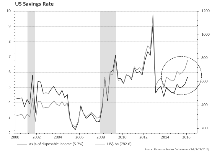
Another way of looking at the discrepancy between income and expenditure is to look at household savings rate. Consumers held off buying despite healthy income gains.
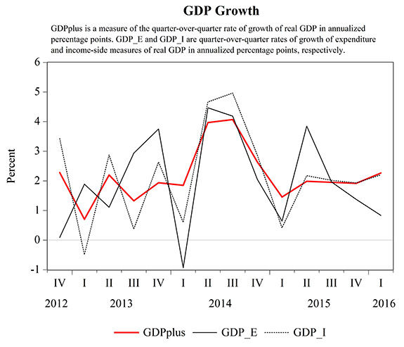


GDP Plus

An estimate of growth using both GDP and GDI is produced by Aruoba, Diebold, Nalewaik, Schorfheide, and Song (ADNSS) and is called GDP Plus. The authors view GDP and GDI as noisy measures of the underlying latent true GDP. Their results are published regularly in the Philadelphia Fed web page. GDP Plus tends to smooth the quarterly changes. The reading for GDP plus in 1Q16 was 2.3% vs the 0.8% in the second GDP print.


GDP: looking at discretionary spending

Discretionary spending often slows down ahead of a recession, and given the weakness in some recent economic and financial indicators at the turn of the year, it is interesting to look at some charts to gauge the behavior of discretionary spending.

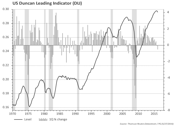
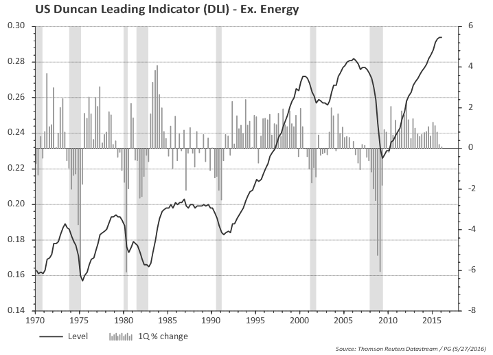
The ratio of growth in spending on consumer durables and private investment to final sales growth (the "Duncan" indicator) is a useful indicator. The chart below shows that this indicator usually turns down before the recession (shaded areas in the chart). The first chart considers total private investment and the second excludes investment in the energy sector. Both suggest discretionary spending slowed down. The indicator ex. energy has not consistently turned down, but it bears watching.


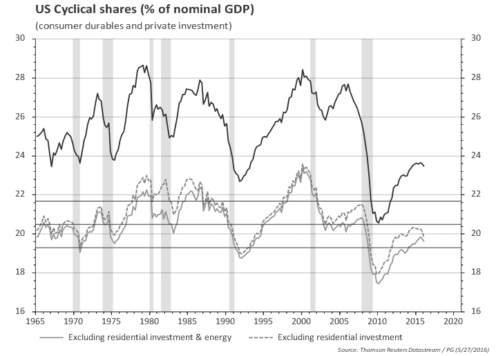
Another way to look at discretionary spending is to look at the share of the income spent on those items. The chart below highlights that consumption of durable goods and investment is still at low level as a share of income. Even excluding residential investment, it seems that there would be room for the share of discretionary spending in total income to grow. Nevertheless, it has turned south since early 2015. Even when one excludes energy, there is a down tick in both 4Q15 and 1Q16 that is important to monitor.


GDP 'residual' seasonality

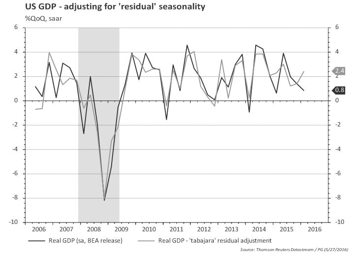
Regarding 'residual' seasonality one can make a very simple adjustment by applying a simple seasonal filter to BEA's published GDP statistics. As the chart below shows, that would move 1Q GDP from 0.8% to 2.4%, more aligned with the growth of GDI reported earlier.


Inventory Cycle

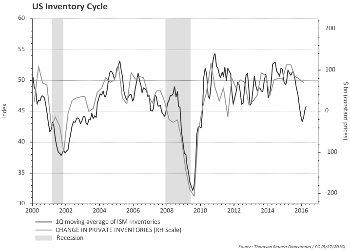
The ISM data still hints at further downside to growth coming from inventory adjustment.


GDP Chart pack

GDP growth not stellar, but is running above potential...

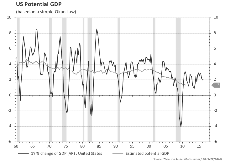
GDP increased 2.0% yoy in 1Q; trend in the last 2 years is 2.4%; 2Q last year was 3.9% so there is a high hurdle for keeping annual GDP at 2%.


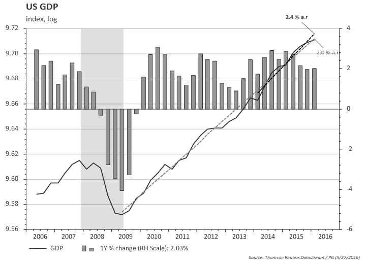
GDP and real GDI (gross domestic income) are both growing at around 2% yoy.


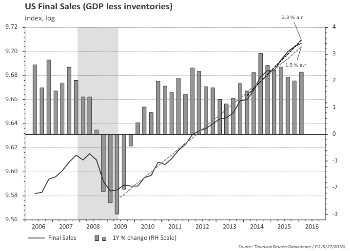
GDP excluding inventories is growing at 2.3% in the last 2 years and 2.3% yoy


The value of goods and services purchased by US residents (regardless of where goods and services were produced) excluding inventories is growing at a healthy 2.7% since 2014.


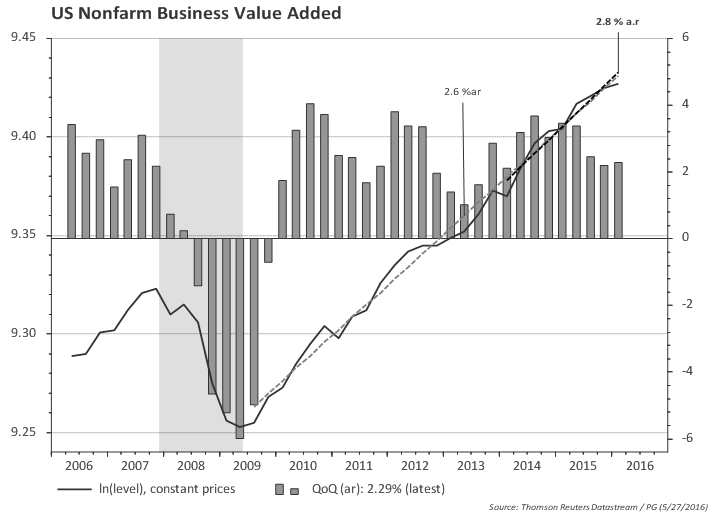
Business value added slowed to 2.3% in Q1, but overall growth since 2014 is 2.8%.


GDP breakdown: Consumption

Consumption is growing at 2.7% yoy (constant prices)


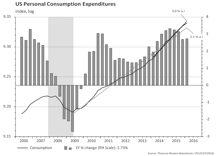
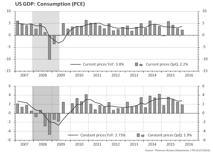
Core consumption (excluding energy and food) is even a bit higher.


GDP breakdown: Investment
The annual pace of investment growth is slowing materially...


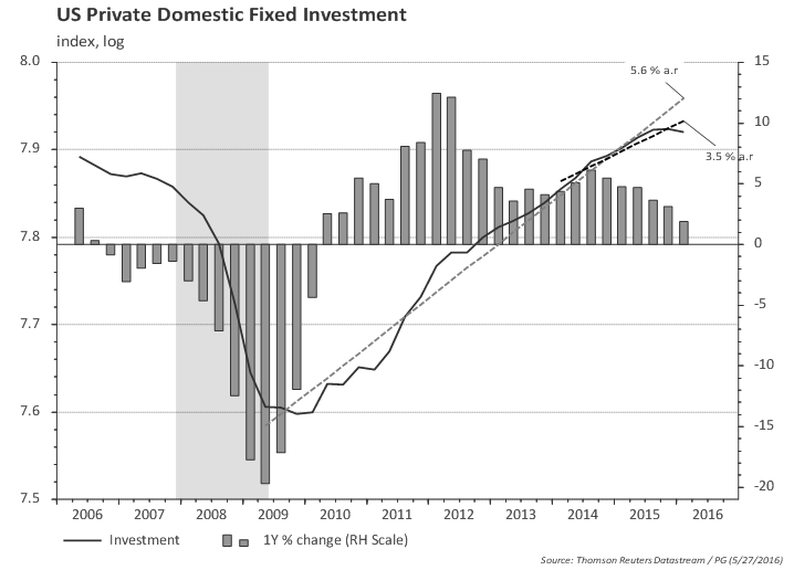
...and the slowdown spread to other areas outside the oil sector in the las two quarters (average 2% growth)

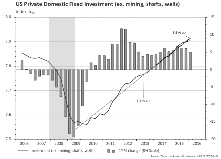
Excluding residential investment, one can see more clearly the slowdown in investment spreading to non-energy sectors.


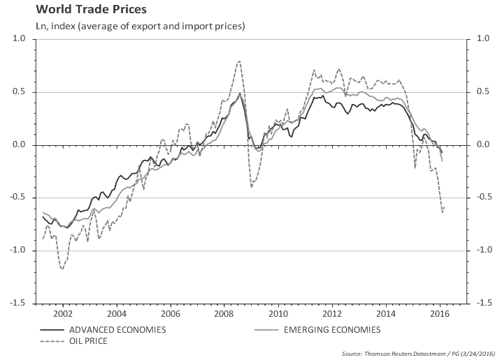
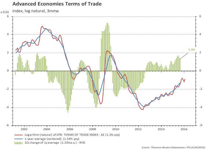
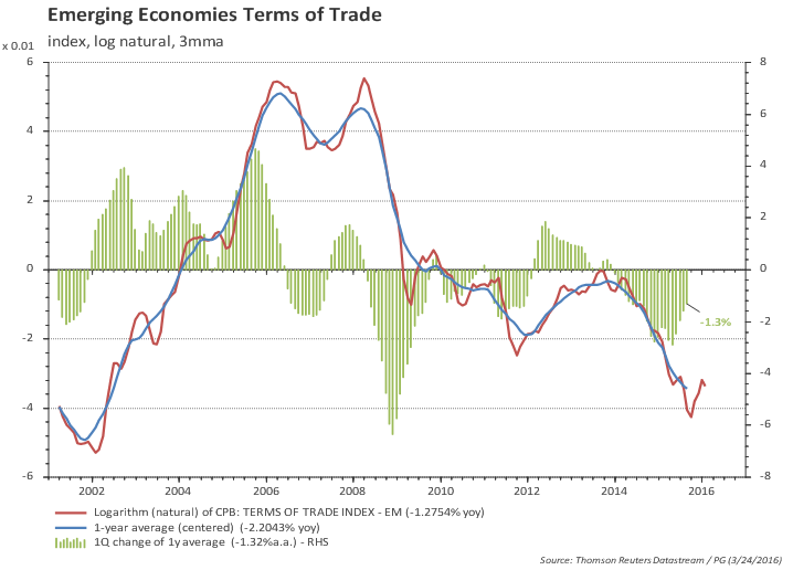
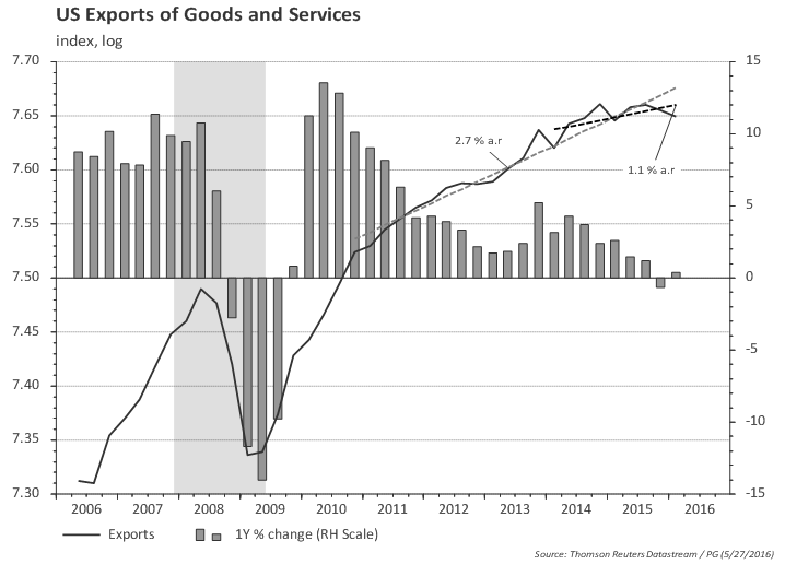
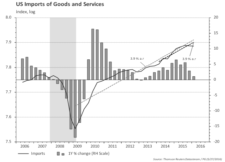
GDP breakdown: External trade

Exports flat, likely due to global growth slowdown and dollar strengthening...


...while imports slowed down substantially in the last few quarters, since the slowdown in investment was combined with slowdown in consumption in the last two quarters.


Is the worst over for net exports?


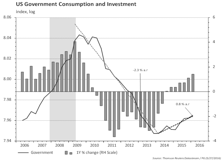
GDP breakdown: government

Government consumption and investment bottomed in 2014 and will likely continue to add to growth next year.


US Inflation broadly in line with consensus

Posted on May 17th, 2016

Main takeaways:
  • Monthly headline (0.4%mom, 1.1%yoy) and core inflation (0.2%mom, 2.1%yoy) broadly in line with market consensus.
  • Inflation momentum at 2.4%.
  • Sticky-price CPI (a proxy for expectations) is at 2.5%.
  • Inflation expectations moving sideways and inflation compensation moving up.

Headline CPI up, core CPI down

Inflation momentum off the highs, but still at 2.4%

Inflation momentum above annual core inflation

Sticky prices suggest inflation is firming

Measures of inflation expectations and compensation


US April/16 Payroll: net job creation slowed down

Posted on May 6th, 2016

Main takeaways:

  • Net job creation slowed down, as suggested by a mix of labor market data ('labor market conditions').
  • Monthly payroll changed from being 'surprisingly resilient' to being 'disappointing'.
  • While one should have expected the pace of job creation to slowdown, April's result can be traced back to 'construction', 'retail sales' and 'government' categories.
  • Looking at the overall trend in those categories, one would hardly be too worried abut the weak prints in April.
  • Also, hours worked and average hourly earnings posted healthy gains in April.
  • Wage growth has steadily increased since early 2015; the Phillips curve seems to be alive and well.
  • The household survey showed a 316 thousands loss of jobs in April; but this was on the back of an average gain of 464 thousands in the first quarter.
  • Despite the loss of jobs, unemployment rate remained stable at 5% since participation rate gave back part of the previous gains (from 63% to 62.8%).


Most people were surprised job creation was very resilient to the tightening of financial conditions and the GDP slowdown.
Now, most people are disappointed by the slowdown in April's payroll...go figure!


Establishment Report
Net job creation in the private sector slowed from about 230k per month in the second half of 2015 to 183k/month in the first four months of 2016. This should not be a major surprise. Indeed, my own track of labor market conditions suggested "underlying private payroll running at around 170 / 183 thousands/month". (See "US Labor Market Conditions").

The chart below shows the evolution of the 6-month payroll average in real time. It shows an uptrend in the second half of 2015 that was at odds with the tightening of financial conditions observed in the same period.


To be fair, the reason for concern / disappointment is probably more linked to the fact that, when looking at divergent signs (employment pickup vs growth slowdown) some observers were putting more emphasis on the more upbeat employment date -- an emphasis that several Fed members often also give in their own speeches.

But specifically for April, we can trace the slowdown in private job creation to construction and retail sales. Construction added, on average, 36 thousand jobs per month in 4Q 15 / 1Q 16 and April reported a mere 1k increase. Similarly, retail sales added 40 thousands per month in 4Q/1Q and April printed minus 3k.

The following two charts plot the employment level in retail and construction, as well as the trend in the last two years and the last 12 months (orange bars show monthly changes). One can hardly see a problem in those employment groups.


Also, the weakness in the establishment report was confined to the headline payroll number, since both hours worked and wages increased in the month. Total hours worked rose a healthy 0.4% in April (for production workers) and now stand at 1.6% above the first quarter average level. This is not great, but compares favorable to the first quarter (1.2%) and to sub 2% GDP growth estimates for the second quarter.


Average hourly earnings also posted a strong 0.3% mom growth in April, leading to 2.5% growth compared to a year ago. But what is more striking, in my view, is that wage growth has steadily increased since early 2015 at the same time that most pundits complain that wages are not going anywhere. The chart below shows the Phillips curve seem to be well and alive: wage growth starts to increase following two years of very strong job growth (2014 and 2015) and with unemployment rate very close to NAIRU.


Total (nominal) labor income rose a strong 0.7% mom in April, but the carry over for the second quarter is a mere 3.3% for production workers and 3.7% for all employees. With rising inflation, this means real purchasing power is going down. Consumers would have to tap their (increasing) savings if consumption is expected to rebound from the weak first quarter.


Household Report
The household report is often very volatile in a monthly basis, but it painted a weaker picture with net job losses of 316 thousands in the month. Truth be told, the household report had shown an average gain of 464 thousands per month in the first quarter. Indeed, even with April's losses, the average 2016 employment gain in the household report stands at 270k/month.

Despite the losses in the month, unemployment rate remained flat at 5% due to a 362 thousand drop in the labor force. Participation rate dropped from 63% to 62.8% and remains close to the level observed in 2014 and early 2015. The pick-up in LFPR since last September has confused many observers and there is no clear reason why that has happened; contrary to often stated views, the pick up does not seem to be due to more people joining the labor force in response to a strong labor market. It is very difficult to have confidence in a short term forecast of LFPR but, over the years, demographics should dominate short-term fluctuations leading to lower participation in the coming years.

If one assumes labor participation remains flat at current levels, then a monthly job creation of 175k would lead to unemployment rate at 4.6% by the end of the year.


The charts below show employment to population ratio and the broader U6 unemployment rate.


April employment by category

Posted on May 6th, 2016

April employment by category

The charts below show employment by category. The blue line is total employment in the category, the orange bar is monthly change and the red line is the linear regression in the last two years and in the last one year.

Total payroll increased 160k in April, after a 208k growth in March (which was revised down from 215k). The trend for the last 6 months slowed from 260k/month by the end of 2014 to 237k in the 6 months to December/15 to 220k in the 6 months to April/16.

Private payroll increased 171k in April, after 184k growth in March (revised down from 195k). The trend for the last 6 months slowed from 250k/month by the end of 2014 to 229k in the 6 months to December/15 to 212k in the 6 months to April/16.

Most of the slowdown in the pace of job creation was concentrated in the goods producing sector (mining and manufacturing); construction jobs are doing ok and the the services sector has, so far, not being affected by manufacturing slowdown. Overall, the 6-month pace of job creation in the goods sector slowed from 50k (at the end of 2014) to close to 18k at the end of 2015 and 16k by Apr/16, while in the services sector it slowed from 200k to 211k to 195k in the same comparison.

Full set of charts in the link: http://bit.ly/us-payroll-category-apr16

US wages: going up

Posted on April 29th, 2016

Main takeaways:
  • ECI is Fed's preferred measure of wage growth.
  • So is is worth looking beyond the headlines...
  • ...and they suggest wage growth is firming.
  • Wages are growing at 2.5% pace, higher than the headline 2.1% would suggest, and...
  • ...the pace of wage growth in increasing -- as one would expect.

The employment cost index (ECI) measures the change in the cost of labor, free from the influence of employment shifts among occupations and industries -- and therefore is often Fed's preferred measure of labor costs. Total compensation costs for civilian workers is the measure that makes the headlines. It includes wages and salaries (around 70% of compensation costs) and benefits. Civilian workers includes private industry and state and local government establishments.

I will focus only on wages and salaries for private industries of the ECI report.

The chart below shows that wages and salaries for private industry workers rose 2.1% yoy in the first quarter of 2016, unchanged from the number reported in 4Q 2015. However, there is clearly a base effect (1Q 2015 seems to have been an outlier) and wages increased 2.6% annualized in the last three quarters (2.9% ar in 1Q 2016).


The ECI report breaks down wages by industry. The chart belows shows a surprising result: wages in the goods-producing industries (and manufacturing) -- a sector which is currently struggling -- is rising faster than wages in services and the growth rate is increasing.


But the above-mentioned discrepancy is also only due to base effect. When looking at the last two or three quarters, wage growth in both goods and services producing industries were close to 2.5% annualized.


One can also look at the detailed industry breakdown (looking into goods and services sectors). There is a lot of noise in the breakdown, but the black line in the chart below shows a simple average of annual wage growth for the main industries.


The chart below plots only the average for the main industries in order to highlight the recent trend.


Another way to understand the base effect is to look at wages by occupational group. We can see that sales & office spiked in the first quarter of 2015 and therefore the annual growth rate collapsed in 1Q 2016.


The chart below highlights the spike in wages for sales & office occupational group that happened in early 2015. There is an interesting paper explaining the volatility in the ECI indexes due to rates of pay that are defined wholly or in part on the results of worker efforts and the BLS reports an index of wages excluding incentive paid occupations. The chart also shows that the spike was related to performance incentives / bonus.


The chart below reproduces wages by occupational groups excluding incentive paid occupations (except for natural resources and construction). One gets a very different picture of wages by looking at this chart.


Now back to all wages. It shows that wages for private industry workers ex. incentive pay is growing at 2.5% yoy (vs. 2.1% when incentive pay is considered) and in the last two quarters wage growth has been 2.6% annualized (vs. 2.3% annualized when incentive pay is considered).


US Mar/2016 retail sales weaker than consensus (again)

Posted on April 13th, 2016


  • March retail sales weaker than consensus (again).
  • Expectations for consumption had already been revised down after the weak Jan/Feb PCE report; today's retail sales report do not change that, despite some upward revision to the previous couple of months.
  • This weakening of consumption is somewhat puzzling given the strong income and employment, high level of consumer confidence, and credit still flowing.
  • Softer retail sales can be attributed to tighter financial conditions until Jan/Feb...
  • ...but, in my view, the bulk (i.e., not all) of the current slowdown continues to be driven by gasoline sales...
  • ...and, perhaps, by some seasonal adjustment issues.

Charts in the link: http://bit.ly/us-retail-mar16

US outlook: dovish and confused (Apr/16)

Posted on April 12th, 2016

Link para a apresentação de US: http://bit.ly/us-outlook-apr16

Main takeaways:
* Global risks the main reason behind FOMC's dovish stance (China, strong dollar).
* I think the odds are for an improving global backdrop in the coming months.
* Global (and US) manufacturing showing some tentative signs of improvement...
* ...but consumption softens in the US. It is likely temporary, but will keep Fed on hold.
* Improving labor force participation and lack of wage growth helps Fed's narrative (but recall ULC is increasing at the same pace as 2004!).
* Yellen has questioned the recent firming of core inflation. She was right once (recall "inflation is noisy" comment in 2014). But not likely to be right this time - a myriad of inflation indicators suggest the pickup in core inflation may be sticky.
* FOMC focus on global risks, asymmetry, and inflation expectations opens room for inflation swaps / TIPS to move higher.

Conclusions:
* As anticipated in our last outlook report the Fed decided to pause to watch: impact of tightening financial conditions, dollar and oil/commodity prices, drop in inflation expectations, path of actual inflation, ISM and manufacturing data, credit data, inventory adjustment.
* But the Fed also opted to emphasize risks to the global economy and the asymmetric risks facing the normalization of policy rates.
* Fed stopped short of supporting a period of inflation overshoot to offset the below target prints.
* Soft-patch in consumption in 1Q (despite incipient manufacturing rebound) keeps pushing forward the next rate increase.
* Risks abound, but my guess is that the economy will remain in the current path, global worries would not escalate and, by mid 2016, the Fed would be ready to signal rate hikes would resume. Two hikes in the second half of 2016 continues to be a reasonable base case (July or Sept for the next one).

Trading views: inflation swaps embedds a lot of downside risks
* Intermediary inflation swaps (5-year swap, 2 years forward) appear too low.
* Inflation in the last five years was 1.4%/year, even after the large drop in energy prices !!
* If oil prices stabilize, inflation would increase to 2.0%-2.5%.
* Recall the Fed story of asymmetric risks favor a pickup in inflation.
* But wasn't this pick-up in inflation the story of 2015? Yes, but China and oil changed the picture. Would it happen again?
* Recall that, a year later, the economy is even closer to NAIRU. Is the Phillips curve really dead?


US March/16 Payroll: resilient labor market

Posted on April 1st, 2016

Main takeaways:

  • Labor market surprisingly resilient: services unabated by manufacturing slump.
  • But the weakness in manufacturing hours/employment needs to be seen in the context of an incipient rebound in US manufacturing activity (ISM bottomed in February).
  • Wage trend appears to be unchanged (not slowing down, but not speeding up either).
  • Unemployment rate has stabilized at the top of Fed’s NAIRU.
  • The 6-month increase in participation rate is big; last time it happened was 1992.
  • Well-behaved wages and increase in labor supply takes the pressure off the Fed (less ammunition for the hawks).
  • BUT that does not mean the markets are right! Mkt consensus is even more dovish than Yellen – something that does not make much sense in the face of strong labor market, rebound in manufacturing, strong consumer confidence, easing of financial conditions, firming of inflation.

Charts and more details: http://bit.ly/us-payroll-mar16


Global trade volumes in January/2016

Posted on March 24th, 2016

Main takeaways:

  • World trade volumes resilient, despite risk-off in financial markets.
  • World trade volumes growing at around 1.8% per year, but with sharp contrast between advanced and emerging economies.
  • Advanced economies imports growing at a strong pace, but growth might have slowed a bit in recent months.
  • Trade volumes in emerging economies, on the other hand, are flat (but with some tentative sign of improvement in imports).

The Netherlands Bureau for Economic Analysis (CPB - Centraal Planbureau) has released world trade volume and industrial production data for January.

World trade prices (exports and imports) dropped materially since mid-2014, in tandem with oil prices. Trade prices fell by 45 % for advanced economies (AE), 60% for emerging economies, while oil prices dropped 120% in the same period ! (welcome to log % changes !!)

This has confused some pundits that often mention the collapse in global trade growth looking only at nominal (or current US$) trade performance. Looking at trade volumes one reaches a different conclusion (more on this below).


The overall drop in trade prices for both emerging and advanced economies masks an important difference: the regions faced opposite terms of trade shocks in recent years. Advanced economies are facing improving terms of trade, while EM economies are facing a declining terms of trade (but with a tentative sign of a rebound, see charts).


Advanced Economies
Looking at trade volumes, one can see that demand (imports) from advanced economies picked up late 2013 and is growing at a healthy 3.5% pace, but might have slowed a bit more recently.


Emerging Economies
Emerging economies show a completely different picture. Both export and import volumes have been relatively flat since mid-2014. More recently, imports are tentatively rebounding, but exports remain lackluster.


World
The consolidated world trade statistics show a puzzling divergence: consolidated imports (of which EM account for one-third) is growing at a healthy pace, while consolidated exports (of which EM account for 40%) are roughly flat. Growth of average trade volume is at 1% yoy, with imports growing at 2%yoy and exports flat.


US Feb/2016 retail sales weaker than consensus

Posted on March 15th, 2016

Main takeaways (http://bit.ly/US_Retail_Feb_2016)
  • February retail sales weaker than consensus; cumulative sales in Dec/Jan revised lower.
  • Most sell-side analysts revised their consumption estimates down, taking a couple of tenths out of expected GDP growth for 1Q 16 (currently in the 1.4% to 2.5% range).
  • Softer retail sales can be attributed to tighter financial conditions and some setback in consumer confidence…
  • …but, in my view, the bulk of the current slowdown continues to be driven by gasoline sales (retail gas prices dropped 10% in February).

Paulo Gustavo Grahl, CFA

Random comments on macro data. Views are my own. Except when they aren't.