Showing all posts tagged #research:


US: tight financial conditions have not (yet?) shaken retail sales

Posted on February 12th, 2016

Main takeaways:
  • January retail sales were a positive surprise.
  • The numbers:
    • advance retail sales increased 0.2%mom, a bit better than market consensus; December was revised up from -0.1% to 0.2%mom gain;
    • excluding gasoline stations, sales increased 0.4%mom and December was revised from flat to +0.2%;
    • control group increased 0.6%mom well above +0.3% consensus, more than offsetting December's -0.3%mom report.
  • Trend growth remains unchanged:
    • 12-month growth of total retail sales ex gasoline stations increased from 4.6% to 4.8%.
    • 12-month growth of the 'control group' remained at 3.3%.
    • Both trends are very close to the 4-year growth pace: consumers remain resilient!
    • Recall that retail prices have trended slightly down -- so the above growth rates understate volume growth!
  • Despite all the headlines of an inventory problem in the retail sector, inventory-to-sales ratio remained roughly flat (excluding gasoline).

The overall trend for retail sales excluding gasoline at gas stations increased to 4.8% in the last 12 months (from 4.6%). This trend is broadly unchanged compared to the longer (4 year) trend of 4.5% nominal growth.


The chart below compares total retail sales with retail excluding gasoline sales. It is clear that most of the slowdown in retail sales since mid-2015 was due to falling gasoline prices. Moreover, even considering gasoline, sales moved up in Nov/Dec/Jan.

Looking at the "control group" (total retail excluding auto dealers, bldg materials, gas stations) a similar growth picture emerges: 3.3% growth in the last year and 3.0% in the last 4 years.

Excluding residual gasoline sales that are inside the control group (fuel dealers) shows a better picture, with adjusted-control sales growing faster than the number reported.


Also, it is important to recall that (control group) retail prices have been trending down in the last year...

...which results in a very healthy growth rate in retail volumes.


Inventories: stable if one excludes gasoline sales (latest: December)


Extra charts

The charts below show retail and food services by kind of business. The red line is an index in log (averages zero in the period) so that a number 10 in the scale means sales are 10% higher than the period average. The red dashed line is the trend in the last 12 months and the blue bars (right scale) are the monthly percentage change. The headline is how the slope of the red dashed line has changed compared to last two months.


Last 12 months trend moved from 6.4% to 7.2% to 7.6%


Last 12 months trend moved from 5.8% to 6.5% to 5.4%


Last 12 months trend from -1.8% to -2.6% to -2.9%


Last 12 months trend moved from 3.0% to 3.9% to 5.3%


Last 12 months trend moved from 1.8% to 1.5% to 1.7%


Last 12 months trend moved from 3.8% to 4.4% to 4.5%


Last 12 months trend moved from -11.6% to -8.8% to -9.3%


Last 12 months trend moved from 1.8% to 1.7% to 1.6%


Last 12 months trend moved from 7.0% to 8.4% to 8.2%


Last 12 months trend from 2.9% to 2.1% to 2.4%


Last 12 months trend moved from 2.9% to 2.9% to 2.9%


Last 12 months trend moved from 7.2% to 7.2% to 7.3%


Last 12 months trend from 5.9% to 6.4% to 6.3%

(Update) Energy crisis and its impact on the US economy

Posted on January 21st, 2016

The Q3 2015 GDP data by industry was released today. Below I've updated the two charts showing value added and gross output for the mining sector. It shows the collapse of the sector continued well into Q3.


I have compiled some key numbers of the mining sector (a broad classification, which includes oil and gas) to give some color on the importance of the sector to the broad US economy. The overall point is that the sector has collapsed in 2015 and will likely continue to contract in 2016. Despite the collapse in 2015, the broader economy has, so far, shown resilience to the crisis in the sector: GDP up by 2%, 2.6 million jobs created (220k/month average), consumer confidence close to highs, etc.

The good news is that the size of the mining sector compared to the overall economy has shrunk substantially. Therefore a similar sized collapse in 2016 would have a smaller impact in the broad economy.

The bad news is that contagion (HY market and overall tightening in financial conditions), assuming the level of stress in the market continues, can be enough to slowdown the economy substantially.


Main takeaways:
  • US mining sector (which encompasses the oil and gas sector):
    • investment is 0.4% of GDP (down from 0.9%);
    • value added is 1.9% of GDP (down from 2.7%);
    • gross output is 2.5% of GDP (down from 4.1%);
    • employment is 0.5% of total employment (down from 0.6%);
    • employment is 730 thousands (down from 860 thousands).
  • Real activity:
    • investment fell 45% in three quarters since 2014 (-55% annualized)
    • this subtracted 0.25 percentage points from the 2.15% GDP growth observed in the last four quarters to Q3 2015.
  • Spillover:
    • a rough calculation (based on employment in the oil-producing vs non oil states) suggests that for each job lost in the mining sector another one was lost outside the sector (one-to-one spillover);
    • if mining employment goes back to 500-550 thousands observed before the boom (2004) that would imply an additional loss of 180k-230k jobs;
    • assuming a one-to-one spillover that would imply total job losses in the 360k to 460k range; wage income loss (based on an average annual individual income of $57.5 thousands) would amount to a mere 0.1% of GDP.
  • Debt of energy/mining companies:
    • Total debt of the energy and mining companies in the S&P500 is $410bn (out of which $40bn is short-term);
    • total debt of energy companies with coverage ratio below 2 is $225bn;
    • about $100bn debt of "really junk" companies (rating below CCC+);
    • median debt to equity ratio for the oil sector is around 50% (up from 40% in 2013), with 10 with debt/equity ratio above 80; median debt/equity for the S&P is 80 (up from 60);
    • cashflow from operating activities (for S&P500 oil and mining companies) dropped from $230bn in 2014 to $155bn in 2015; this compares to gross operating surplus (from BEA data) going from around $300bn in 2014 to $200bn in 2015.
  • HY debt and financial conditions


How big is the oil/mining sector?
Investment on mining exploration, shafts, and wells structures peaked at 30% of the total nonresidential investment in structures, but has already dropped to 15% (Obs: this sector is broader than just the oil & gas).
However, investment on the sector is much smaller when compared with overall investment or GDP. Mining exploration, shafts, and wells structures account for 2.5% of total investment (down from 5.7%) and for 0.4% of GDP (down from 0.9%).


Both the increase since early 2000 and the recent drop are not a merely a price effect -- when comparing quantities it is also clear that the volume of investment in the sector outpace the overall volume of nonresidential investment in structures from 2000 to 2011 and has now underperformed materially since 2014.


The chart below shows that the high frequency data on rig count is a good proxy for the investment in the sector; and it suggests further downside in the near term.

GDP measured via the product approach is released with a delay and the most recent data refers to Q2 2015. Data is only available (quarterly) for the mining sector, which is broader than the oil sector. Value added in the oil and gas extraction sector accounts for about two-thirds of the broader mining sector. The chart below shows that the value added by the mining sector amounts to 1.9% of GDP, down 0.8 percentage points from the 2.7% peak in mid-2014.


But value added does not account for the sector spending on intermediate inputs (materials, services). For the mining industry, intermediate inputs are roughly 45% of the value added (a bit lower for the oil sector alone: 35%). The chart shows that gross output of the mining sector amounts to 2.5% of GDP, down 1.6 percentage points from the recent peak in mid-2014.


Employment
There are currently around 185 thousands employed in the oil and gas extraction sector, down from 200 thousands by late 2014. This represents a mere 0.1% of total employment. Even though the oil and gas industry accounts for about two-thirds of gross output in the mining sector (and two-thirds of value added) it accounts for a much lower share of total employment (25%). Total employment in the mining sector fell from 860 thousands to 730 thousands in one year (and now accounts for 0.5% of total employment). Before the boom, mining employment was 500 thousands (0.4% of total employment).


Another way of looking at the impact of the mining crisis in employment and its potential spillovers is to split the US states in oil producing vs non-oil states.
The chart below clearly shows that employment growth in the oil producing states has slowed since late 2014. Total employment in the oil producing states, however, is much smaller than the overall employment in non-oil states (25 million vs 118mn).

If employment in the oil producing states (outside of the mining sector) had moved in tandem with employment in the non-oil states, then employment in the non-mining sector of the oil states would be around 140 thousands higher than what is currently observed (or an average of 12k/month). Comparing this with the loss of employment in the mining sector (130 thousands) one can guess that the spillover to employment in other sectors was large (about one-to-one). The good news is that the counterfactual (i.e., the employment growth without the oil / mining crisis) would have been 2.9 million in 2015, rather than the 2.6 million reported.

If employment in the mining sector goes back to levels before the boom, around 500-550 thousands (depending on whether the low is measured in absolute or relative to total employment), that would imply an additional loss of 180k-230k jobs on top of the 130k loss reported in 2015.

Assuming the same spillover reported above, that would imply total job losses in the 360k-460k range. If this loss happens over a one-year period it would reduce job growth from the 2.9 million pace (counterfactual) to 2.4 million (substantial, but still a healthy 200k/month monthly payroll !!).
Even doubling the spillover (2 jobs for each job loss in the mining sector), the outcome would be job growth of 2.2 million (185k/month) !
Note:
Off course it all depends on the counterfactual job growth of 2.9 million / year, which is 2% yoy growth. If the counterfactual (or underlying growth, not related to the mining direct and/or indirect impact) slows down to, say, 1.5% yoy, then average monthly payroll would be in the 120k-140k per month ballpark.


Income
The average mining worker earns $1250/week and works 46 weeks/year, taking home an annual pay of $57,500. If, as assumed above, 200 thousands mining workers lose a job, that will represent a loss of $11.5bn in total wages. Even accounting for the one-to-one spillover mentioned above, the total wage loss would amount to $23.6bn, a mere 0.1% of GDP.


US: inflation soft patch likely in the near term as oil prices move lower

Posted on January 20th, 2016

Main takeaways:
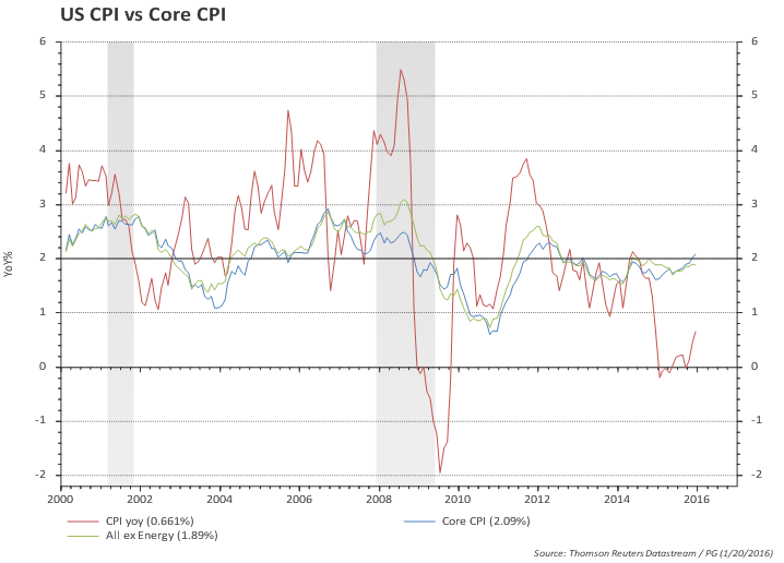
  • Headline and core inflation both ticked up in December, but were a bit below market consensus.
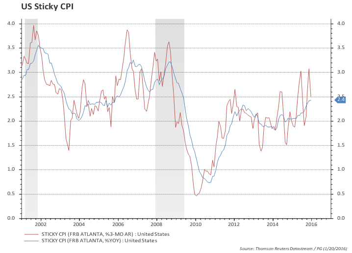
  • Sticky-price CPI (a sign of anchored expectations) ticked down but is still at 2.5%.
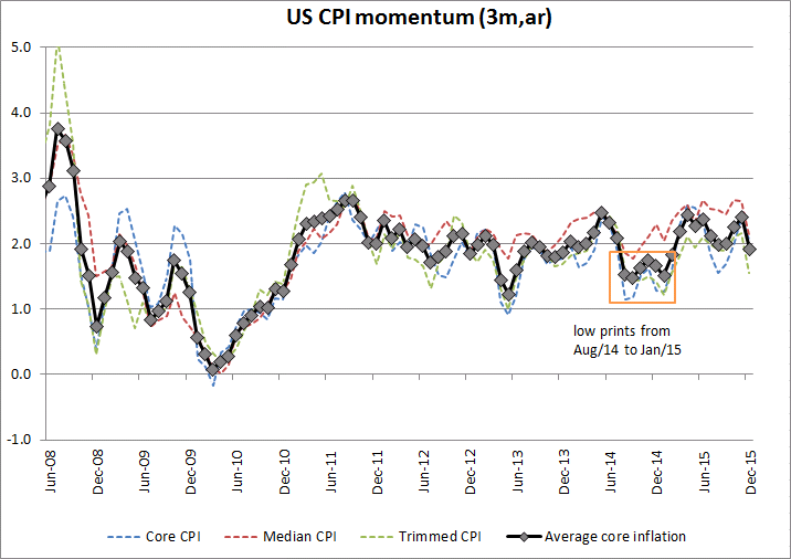
  • Inflation momentum softened from 2.4% to 1.9%.
  • If oil prices continue to move lower, inflation (headline and core) will likely soften in the near term, mimicking the path observed in late 2014 / early 2015.


Headline and core inflation ticked up...
...but inflation momentum softened back to 2%


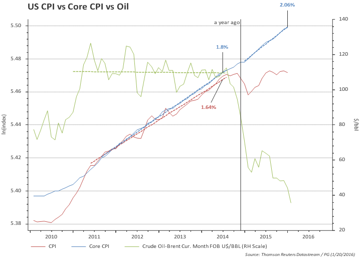
The chart below shows CPI in the last 6 years. Headline CPI was growing close to the underlying core CPI in a period where oil prices were roughly flat, but the gap opened from mid-2014 onwards with the sharp drop in oil prices. It is interesting also to note that the strong US dollar has, so far, barely dented the trend in core inflation.

Headline and core inflation could soften again reflecting lower oil prices, repeating what happened in late 2014 early 2015

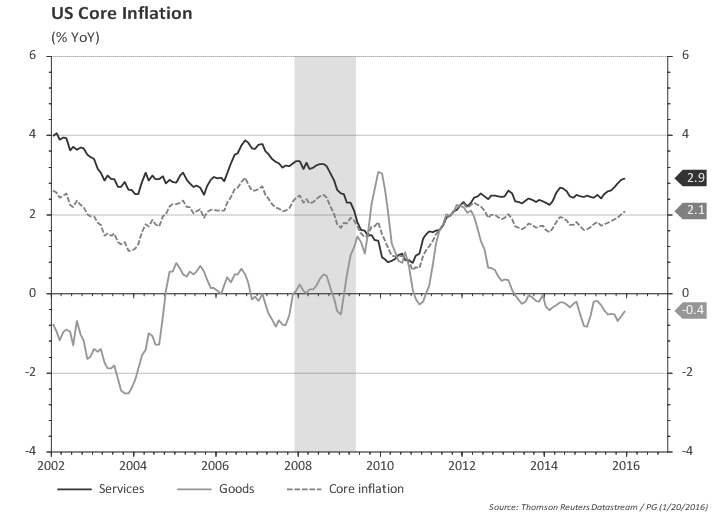
But behind slight increase in YoY core inflation there's a growing divergence. Core goods are 0.4% lower than a year ago while core services are 2.9% higher.

Sticky-Price CPI (a sign of anchored expectations) is high
The Atlanta Fed produces a breakdown between 'sticky' vs 'flexible' prices and they argue 'sticky' prices (which is a weighted basket of items that change prices relatively slowly) "appear to incorporate expectations about future inflation to a greater degree than flexible prices".


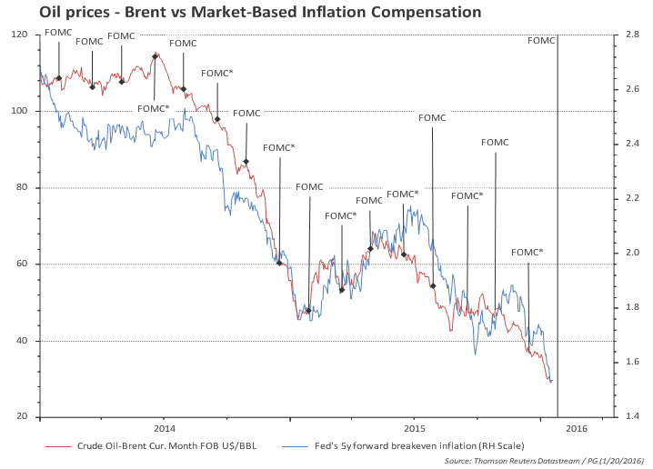
Market-based inflation expectations and compensation: this is key for the FOMC!


Energy crisis and its impact on the US economy

Posted on January 19th, 2016

I have compiled some key numbers of the mining sector (a broad classification, which includes oil and gas) to give some color on the importance of the sector to the broad US economy. The overall point is that the sector has collapsed in 2015 and will likely continue to contract in 2016. Despite the collapse in 2015, the broader economy has, so far, shown resilience to the crisis in the sector: GDP up by 2%, 2.6 million jobs created (220k/month average), consumer confidence close to highs, etc.

The good news is that the size of the mining sector compared to the overall economy has shrunk substantially. Therefore a similar sized collapse in 2016 would have a smaller impact in the broad economy.

The bad news is that contagion (HY market and overall tightening in financial conditions), assuming the level of stress in the market continues, can be enough to slowdown the economy substantially.


Main takeaways:
  • US mining sector (which encompasses the oil and gas sector):
    • investment is 0.4% of GDP (down from 0.9%);
    • value added is 1.9% of GDP (down from 2.7%);
    • gross output is 2.5% of GDP (down from 4.1%);
    • employment is 0.5% of total employment (down from 0.6%);
    • employment is 730 thousands (down from 860 thousands).
  • Real activity:
    • investment fell 45% in three quarters since 2014 (-55% annualized)
    • this subtracted 0.25 percentage points from the 2.15% GDP growth observed in the last four quarters to Q3 2015.
  • Spillover:
    • a rough calculation (based on employment in the oil-producing vs non oil states) suggests that for each job lost in the mining sector another one was lost outside the sector (one-to-one spillover);
    • if mining employment goes back to 500-550 thousands observed before the boom (2004) that would imply an additional loss of 180k-230k jobs;
    • assuming a one-to-one spillover that would imply total job losses in the 360k to 460k range; wage income loss (based on an average annual individual income of $57.5 thousands) would amount to a mere 0.1% of GDP.
  • Debt of energy/mining companies:
    • Total debt of the energy and mining companies in the S&P500 is $410bn (out of which $40bn is short-term);
    • total debt of energy companies with coverage ratio below 2 is $225bn;
    • about $100bn debt of "really junk" companies (rating below CCC+);
    • median debt to equity ratio for the oil sector is around 50% (up from 40% in 2013), with 10 with debt/equity ratio above 80; median debt/equity for the S&P is 80 (up from 60);
    • cashflow from operating activities (for S&P500 oil and mining companies) dropped from $230bn in 2014 to $155bn in 2015; this compares to gross operating surplus (from BEA data) going from around $300bn in 2014 to $200bn in 2015.
  • HY debt and financial conditions


How big is the oil/mining sector?
Investment on mining exploration, shafts, and wells structures peaked at 30% of the total nonresidential investment in structures, but has already dropped to 15% (Obs: this sector is broader than just the oil & gas).
However, investment on the sector is much smaller when compared with overall investment or GDP. Mining exploration, shafts, and wells structures account for 2.5% of total investment (down from 5.7%) and for 0.4% of GDP (down from 0.9%).


Both the increase since early 2000 and the recent drop are not a merely a price effect -- when comparing quantities it is also clear that the volume of investment in the sector outpace the overall volume of nonresidential investment in structures from 2000 to 2011 and has now underperformed materially since 2014.


The chart below shows that the high frequency data on rig count is a good proxy for the investment in the sector; and it suggests further downside in the near term.

GDP measured via the product approach is released with a delay and the most recent data refers to Q2 2015. Data is only available (quarterly) for the mining sector, which is broader than the oil sector. Value added in the oil and gas extraction sector accounts for about two-thirds of the broader mining sector. The chart below shows that the value added by the mining sector amounts to 1.9% of GDP, down 0.8 percentage points from the 2.7% peak in mid-2014.


But value added does not account for the sector spending on intermediate inputs (materials, services). For the mining industry, intermediate inputs are roughly 45% of the value added (a bit lower for the oil sector alone: 35%). The chart shows that gross output of the mining sector amounts to 2.5% of GDP, down 1.6 percentage points from the recent peak in mid-2014.


Employment
There are currently around 185 thousands employed in the oil and gas extraction sector, down from 200 thousands by late 2014. This represents a mere 0.1% of total employment. Even though the oil and gas industry accounts for about two-thirds of gross output in the mining sector (and two-thirds of value added) it accounts for a much lower share of total employment (25%). Total employment in the mining sector fell from 860 thousands to 730 thousands in one year (and now accounts for 0.5% of total employment). Before the boom, mining employment was 500 thousands (0.4% of total employment).


Another way of looking at the impact of the mining crisis in employment and its potential spillovers is to split the US states in oil producing vs non-oil states.
The chart below clearly shows that employment growth in the oil producing states has slowed since late 2014. Total employment in the oil producing states, however, is much smaller than the overall employment in non-oil states (25 million vs 118mn).

If employment in the oil producing states (outside of the mining sector) had moved in tandem with employment in the non-oil states, then employment in the non-mining sector of the oil states would be around 140 thousands higher than what is currently observed (or an average of 12k/month). Comparing this with the loss of employment in the mining sector (130 thousands) one can guess that the spillover to employment in other sectors was large (about one-to-one). The good news is that the counterfactual (i.e., the employment growth without the oil / mining crisis) would have been 2.9 million in 2015, rather than the 2.6 million reported.

If employment in the mining sector goes back to levels before the boom, around 500-550 thousands (depending on whether the low is measured in absolute or relative to total employment), that would imply an additional loss of 180k-230k jobs on top of the 130k loss reported in 2015.

Assuming the same spillover reported above, that would imply total job losses in the 360k-460k range. If this loss happens over a one-year period it would reduce job growth from the 2.9 million pace (counterfactual) to 2.4 million (substantial, but still a healthy 200k/month monthly payroll !!).
Even doubling the spillover (2 jobs for each job loss in the mining sector), the outcome would be job growth of 2.2 million (185k/month) !
Note:
Off course it all depends on the counterfactual job growth of 2.9 million / year, which is 2% yoy growth. If the counterfactual (or underlying growth, not related to the mining direct and/or indirect impact) slows down to, say, 1.5% yoy, then average monthly payroll would be in the 120k-140k per month ballpark.


Income
The average mining worker earns $1250/week and works 46 weeks/year, taking home an annual pay of $57,500. If, as assumed above, 200 thousands mining workers lose a job, that will represent a loss of $11.5bn in total wages. Even accounting for the one-to-one spillover mentioned above, the total wage loss would amount to $23.6bn, a mere 0.1% of GDP.


US: December was a really bad month for retail; but trend is unchanged

Posted on January 15th, 2016

Main takeaways:
  • December was a really bad month! But followed a strong November...
  • The numbers:
    • advance retail sales dropped 0.1%mom, in line with market consensus; gave back part of the 0.4%mom gain in November;
    • excluding gasoline stations, sales were flat in the month (vs. +0.5%mom in November);
    • control group dropped 0.3%mom well below +0.3% consensus; gave back part of the 0.5%mom gain in November.
  • However, despite monthly disappointment, trend growth remains unchanged:
    • 12-month growth of total retail sales ex gasoline stations increased from 4.4% to 4.6%.
    • 12-month growth of the 'control group' slowed from 3.4% to 3.3%.
    • Both trends are very close to the 4-year growth pace: consumers remain resilient!
    • Recall that retail prices have trended slightly down -- so the above growth rates understate volume growth!
  • Despite all the headlines of an inventory problem in the retail sector, inventory-to-sales ratio remained roughly flat (excluding gasoline).

The overall trend for retail sales excluding gasoline at gas stations increased slightly to 4.6% in the last 12 months (from 4.4%). This trend is broadly unchanged compared to the longer (4 year) trend of 4.5% nominal growth.


The chart below compares total retail sales with retail excluding gasoline sales. It is clear that most of the slowdown in retail sales since mid-2015 was due to falling gasoline prices.

Looking at the "control group" (total retail excluding auto dealers, bldg materials, gas stations) a similar growth picture emerges: 3.3% growth in the last year and 3.0% in the last 4 years.

Excluding residual gasoline sales that are inside the control group (fuel dealers) shows a better picture, with adjusted-control sales growing one percentage point faster than the number reported.


Also, it is important to recall that (control group) retail prices have been trending down in the last year...

...which results in a very healthy growth rate in retail volumes.


Inventories: stable if one excludes gasoline sales (latest: November)


Extra charts

The charts below show retail and food services by kind of business. The red line is an index in log (averages zero in the period) so that a number 10 in the scale means sales are 10% higher than the period average. The red dashed line is the trend in the last 12 months and the blue bars (right scale) are the monthly percentage change. The headline is how the slope of the red dashed line has changed compared to last two months.


Last 12 months trend moved from 6.7% to 6.4% to 7.2%


Last 12 months trend moved from 5.5% to 5.8% to 6.5%


Last 12 months trend from -3.8% to -1.8% to -2.6%


Last 12 months trend moved from 3.4% to 3.0% to 3.9%


Last 12 months trend moved from 1.9% to 1.8% to 1.5%


Last 12 months trend moved from 4.0% to 3.8% to 4.4%


Last 12 months trend moved from -14.2% to -11.6% to -8.8%


Last 12 months trend moved from 2.6% to 1.8% to 1.7%


Last 12 months trend moved from 6.0% to 7.0% to 8.4%


Last 12 months trend from 2.0% to 2.9% to 2.1%


Last 12 months trend moved from 3.9% to 2.9% to 2.9%


Last 12 months trend moved from 6.7% to 7.2% to 7.2%


Last 12 months trend from 5.6% to 5.9% to 6.4%

US December employment by category

Posted on January 11th, 2016

December employment by category

The charts below show employment by category. The blue line is total employment in the category, the orange bar is monthly change and the red line is the linear regression in the last two years.

Total payroll increased 292k in December, after a 252k growth in November (which was revised up from 211k). The trend for the last 6 months slowed from 280k/month by the end of last year to 229k in the 6 months to December.

Private payroll increased 275k in December, after 240k growth in November (revised up from 197k). The trend for the last 6 months slowed from 270k/month by the end of last year to 219k in the 6 months to December.

Most of the slowdown in the pace of job creation was concentrated in the goods producing sector (mining and manufacturing); construction jobs are doing ok and the the services sector has, so far, not being affected by manufacturing slowdown. Overall, the 6-month pace of job creation in the goods sector slowed from 50k (at the end of last year) to close to 17k, while in the services sector it slowed from 220k to 202k in the same comparison.

Employment categories

  • Total nonfarm
    • Total private
      • Goods-producing
        • Mining and logging
        • Construction
        • Manufacturing
      • Private service-providing
        • Trade, transportation, and utilities
          • Wholesale trade
          • Retail trade
          • Transportation and warehousing
          • Utilities
        • Information
        • Financial activities
        • Professional and business services
          • Temporary help services
        • Education and health services
          • Educational services
          • Health care and social assistance
        • Leisure and hospitality
        • Other services
    • Government

Charts

Total nonfarm (trend from 242.1 to 241.7 to 243.3/m)

Total private (trend from 235.0 to 234.5 to 235.5/m)

Goods-producing (trend from 32.4 to 30.4 to 28.9/m)

Mining and logging (trend from -1.5 to -2.0 to -2.3/m)

Construction (trend from 21.8 to 21.7 to 21.8/m)

Manufacturing (trend from 13.0 to 12.0 to 11.2/m)

Private service-providing (trend from 202.6 to 204.1 to 206.7/m)

Wholesale trade (trend from 7.8 to 7.5 to 7.3/m)

Retail trade (trend from 23.9 to 24.2 to 23.9/m)

Transportation and warehousing (trend from 12.1 to 11.4 to 11.5/m)

Utilities (trend from 0.7 to 0.8 to 0.8/m)

Information (trend from 3.8 to 3.9 to 4.2/m)

Financial activities (trend from 11.8 to 12.2 to 12.4/m)

Professional and business services (trend from 54.2 to 54.4 to 54.9/m)

Temporary help services (trend from 11.7 to 11.2 to 11.1/m)

Educational services (trend from 4.1 to 4.4 to 4.6/m)

Health care and social assistance (trend from 40.9 to 42.3 to 43.8/m)

Leisure and hospitality (trend from 37.1 to 37.3 to 37.5/m)

Other services (trend from 6.1 to 5.8 to 5.8/m)

Government (trend from 7.1 to 7.2 to 7.7/m)


Dr. Paulo Gustavo Grahl, CFA (2016-01-11)


US FOMC Minutes digest: concerned about inflation; risk management was behind decision to raise rates

Posted on January 6th, 2016

Main takeaways:
  • Minutes confirmed risk management was key to the decision to increase rates (see US FOMC digest: risk management):
    • monetary policy has lags;
    • for FOMC members, an 'early' and gradual hike, therefore, reduces the risk "it might need to tighten policy abruptly" later on;
    • the asymmetric risks posed by rates still close to zero was dealt with by promising to keep a large balance sheet "until normalization" of interest rates is "well under way."
  • FOMC minutes stressed a couple of times the dichotomy between domestic and foreign developments:
    • participants took the view that domestic demand would only be partially offset by weakness in net exports, and
    • acknowledged downside risks from global and financial developments had receded.
  • Inflation outlook was debated at length by FOMC:
    • members noted the decline in oil prices "was likely to exert some additional transitory downward pressure on inflation in the near term.
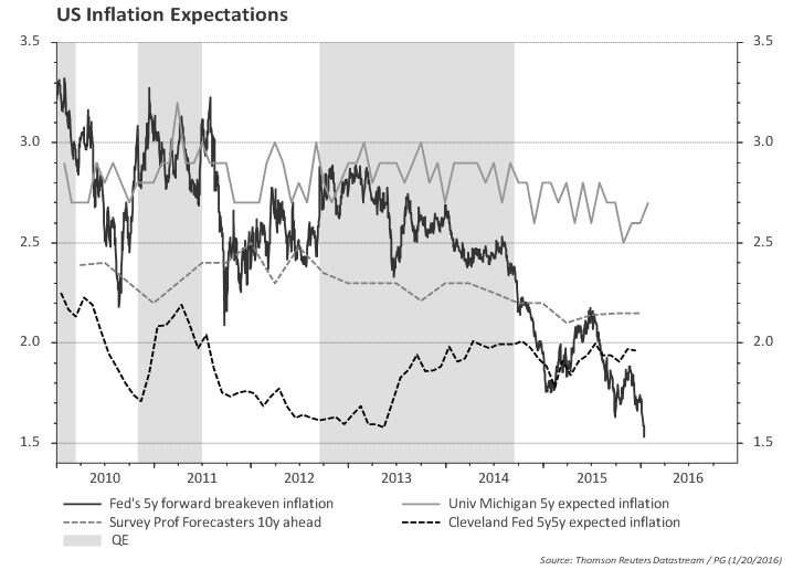
    • members also noted that "some survey-based measures" of inflation expectations moved down, and several members expressed unease with that.
    • for some members, risks to their inflation forecasts remained considerable (further shocks to oil and commodities; a sustained rise in US dollar).
    • a couple worried global disinflationary forces could be more important than improving labor market for the inflation outlook.
    • some members said the decision to raise rates was a close call, given uncertainty about inflation dynamics.
  • Above mentioned concern with inflation was reflected in the statement saying that the Committee "would carefully monitor actual and expected progress toward its inflation goal."
  • However, the hurdle for inflation is not very tough -- underlying PCE momentum is running in the 1.2%-1.5% range, and the Fed central tendency forecasts for 2016 is 1.2%-1.7%.

US External Trade likely to be a drag on growth again in Q4

Posted on January 6th, 2016

Main takeaways:
  • Net exports likely to be a drag on growth again (~0.4pp).
  • Real imports dropped in the last three months, but the trend in the last 12-months is still a healthy 4.6% growth pace.
  • Weak US exports hit by strong dollar and sluggish global trade.


Real non-petroleum exports are down 2% in Oct/Nov vs Q3 and imports are down 0.6% in the same comparison. Excluding petroleum, exports volume contracted by 1.6% and imports by 0.4%.

Trade results for October/November, if repeated in December, would lead to another negative contribution of external trade to growth of around 0.4pp. But negative contribution from external trade to growth, per se, does not imply overall GDP growth will be weak (see for instance the negative contributions from net exports to growth in the 1997-2005 period)

The charts below show the volumes of non-petroleum exports and imports. Exports volume is flat while imports volume is growing at around 5%.

Last 20 years (trend shows last 2 years)
Last 3 years (trend shows last 12 months)
YoY growth

The jump in import growth precedes the stronger USD and coincides with an upturns in job creation and consumption that happened in 2014 -- therefore not likely to be a strong consequence of the currency strength and import substitution (although it may play some role).
The slowdown in exports, however, happened at the turn of the year, and therefore could potentially be a quick response to the strenghtening of the dollar that started in mid-2014.

However, the chart below shows that US exports are moving roughly in tandem with world exports. US exports relative to world exports dropped since the start of 2015, but the size of the adjustment does not suggest that the dollar strengthening is playing a major role for weak US exports.

Of course it could be just a matter of time for US exports to shrink relative to world exports, but the recent weak performance seems more likely a result of sluggish world trade rather than dollar strength.

Meanwhile, the ISM export orders improved a bit but still do not suggest upside in the near term.


US 3Q15 GDP (third release): looking for signs of a turning point

Posted on December 22nd, 2015

Main takeaways:
  • The third release of 3Q GDP didn't change the overall picture.
  • Given the weakness in some recent economic and financial indicators it is important to track credit and discretionary spending for signs of a turning point.
  • The current 2% pace of GDP growth is still likely enough to reduce labor market slack.
  • Domestic demand is growing at a healthy 3%; household consumption also growing at 3%.
  • Investment (ex. oil) is growing at 6% pace.
  • Government consumption and investment bottomed in 2014 (after being a drag in the 2011-2013) and will likely continue to add to growth next year.


GDP revised down a tenth to 2.0%; real GDI revised down four tenths to 2.7%.
Third quarter GDP was revised down by 0.1pp, a bit better than market consensus. The small downward revision to the percent change in real GDP primarily reflected a downward revision to private inventory investment.


GDP: heading towards recession?

Given the weakness in some recent economic and financial indicators, it is interesting to look at some charts that historically have shown turning points in the economy.

The flow of credit to the economy (as a share of GDP) often -- but not always -- peaks ahead of or coincidently with recessions. The chart below shows that, overall, credit flows are at a relatively modest pace for both corporates and households (compared to the history since 1970). Nevertheless, the pace of credit creation has slowed for households since 1Q and nonfinancial corporates since 2Q. Bank lending data at a higher frequency (weekly) does not suggest a material slowdown in credit, but this bears watching given the sharp widening of HY spreads.

Another point worth looking is the strength in discretionary spending. One way to look at it is to calculate the ratio of growth in spending on consumer durables and private investment to final sales growth (the "Duncan" indicator). The chart below shows that this indicator usually turns down before the recession (shaded areas in the chart). The first chart considers total private investment and the second excludes investment in the energy sector. So far discretionary spending is not signaling an impending recession.


Another way to look at discretionary spending is to look at the share of the income spent on those items. The chart below highlights that consumption of durable goods and investment is still at low level as a share of income. Even excluding residential investment, it seems that the share of discretionary spending in total income is low. Excluding housing and energy, one can see that the share of discretionary consumption/investment is still increasing.


GDP Chart pack

GDP is running above potential...

GDP increased 2.1% yoy in 3Q; trend in the last 2 years is 2.5%


GDP and real GDI (gross domestic income) are both growing at around 2% yoy.


GDP excluding inventories is growing at 2.5% in the last 2 years and 2.1%yoy


The value of goods and services purchased by US residents (regardless of where goods and services were produced) excluding inventories is growing at a healthy 2.9% since mid-2014.


Business value added slowed to 1.8% in Q3, but overall 2.6% growth trend is unchanged


GDP breakdown: Consumption

Consumption is growing at 3% (constant prices)


Core consumption (excluding energy and food) is even a bit higher.


GDP breakdown: Investment
The annual pace of investment growth is slowing...


...but recall that there is a collapse in investment in the oil sector.


Excluding oil sector, overall investment picture is improving, with annual growth rates at 6%. Note that this is not far away from the pace of investment growth before the great recession.


GDP breakdown: External trade

Exports slowed materially, likely due to global growth slowdown and dollar strengthening...


...while imports are growing at a healthy 5% pace.


GDP breakdown: government

Government consumption and investment bottomed in 2014 and will likely continue to add to growth next year.


Philadelphia Fed Business Outlook: weak + interesting special question

Posted on December 17th, 2015

Weak headline Philly Fed, below expectations of a roughly flat 1.0 reading.
The "modified" Philly Fed (using weights / components similar to ISM) shows a small up-tick, but it also depicts a very weak manufacturing.

Philly Fed Diffusion Index
Philly Fed Modified (according to ISM weights)

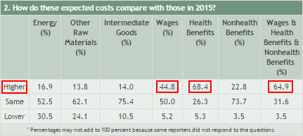
The special question focused on business costs. As expected, input costs other than labor costs are not a reason for concern. However, a significant share of business expect wage and health costs to increase. This is negative for profits.


Paulo Gustavo Grahl, CFA

Random comments on macro data. Views are my own. Except when they aren't.