Latest CFNAI print suggests GDP running just above 2%

Posted on October 26th, 2015

Filtering US GDP noise using CFNAI

Main takeaways:
  • “Potential" GDP growth (the one associated with CFNAI at zero) is close to 2.7% using the sample since 1985.
  • Latest CFNAI reading of -0.09 in Sep/2015 is usually associated with GDP growth at 2.3%.

Introduction

The Chicago Fed publishes monthly the CFNAI - Chicago Fed National Activity Index, and index designed to gauge overall economic activity and inflation pressure.

The CFNAI is a weighted average of 85 monthly indicators of economic activity, covering four broad categories: production and income; employment; personal consumption & housing; and sales, orders & inventories. A complete list of the variables included can be seen here. The CFNAI is the first principal component (common trend) of the 85 time series.

The CFNAI is constructed to have an average value of zero and a standard deviation of one. A positive reading means the economy is growing above trend. The 3-month moving average of the index is often used to filter monthly noise. According to Chicago Fed research, moving from an expansion period to a reading below -0.7 suggests a recession has begun. A reading above +0.2 suggests the recession has ended, and above +0.7 suggests a period of sustained increasing inflation has begun.

The chart below shows the CFNAI from Mar/1967 to Sep/2015.

The CFNAI has a positive correlation with GDP growth. The chart below shows that GDP trend growth (as measured by a CFNAI at zero) is around 2.8% for the full sample (when based on a linear regression). When looking at a local linear regression (loess) model, GDP trend growth is estimated at 2.7%, and the latest CFNAI printed -0.09 (3mma, Sep/2015) is associated with GDP growth at around 2.5%.

Checking for parameter stability

Formal tests for structural breaks in the relationship between GDP growth and CFNAI (not shown) do not suggest a statistically significant break in the parameters,i.e., the GDP growth rate equivalent to CFNAI at zero can be assumed constant for the whole sample period.


One way to illustrate that is to plot the intercept \(\alpha\) for the rolling linear regression \(GDP_t = \alpha + \beta \times CFNAI_t + \epsilon_t\) starting with the first 10 years of data up to the most recent quarter. The dotted lines represent one standard deviation of the coefficient estimate and show that there’s no structural break in the coefficient \(\alpha\). However, there is a (not statistically significant) jump in the intercept by mid-1980s, which coincides with the period when inflation finally moderated after the oil shock.

Using data since 1985


The chart below plots CFNAI and GDP growth restricting the sample to start in 1985. GDP trend growth (as measured by a CFNAI at zero) is around 2.8% for the sample since 1985 (when based on a linear regression). When looking at a local linear regression (loess) model, GDP trend growth is estimated at 2.7% in the same period. The latest print of CFNAI is associated with GDP growth at around 2.3% (chart).

Using data since 2000

Restricting the sample to start in 2000 we obtain:


GDP trend growth (as measured by a CFNAI at zero) is around 2.5% for the sample since 2000 (when based on a linear regression). When looking at a local linear regression (loess) model, GDP trend growth is estimated at 2.4% in the same period. The latest print of CFNAI is associated with GDP growth at around 2% (chart).


Dr. Paulo Gustavo Grahl, CFA (2015-10-26)


JOLTS - chartpack (Aug-15): robust labor market

Posted on October 16th, 2015


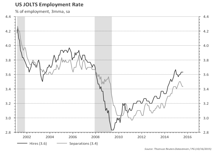
Hires rate at a healthy level. Separations rate also trending up; separations include voluntary quits, layoffs, and others.

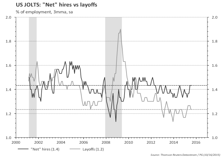
Assuming voluntary quits and others (e.g., retirement) are part of the 'normal' labor market, we can split the above chart into 'net' hires (i.e, hires minus quits and minus others) and layoffs:

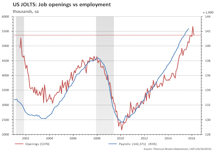
There are 5.4 million job openings in the US...

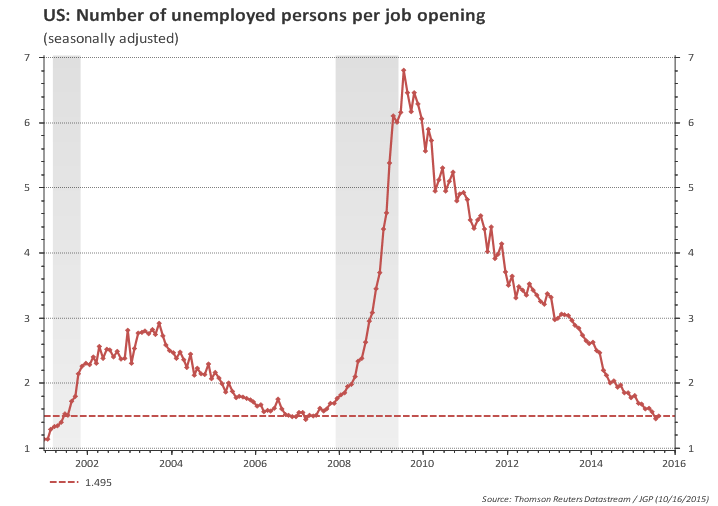
...and 7.9 million unemployed

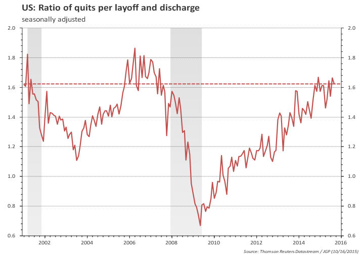
Quits ratio is high relative to layoffs.

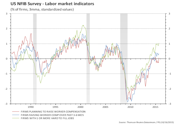
No wonder some companies are having hard time finding people to work...

...despite paying higher wages and planning to continue to increase wages

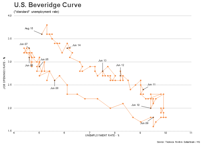
Current job openings rate was, in the past, compatible with much lower unemployment rates...

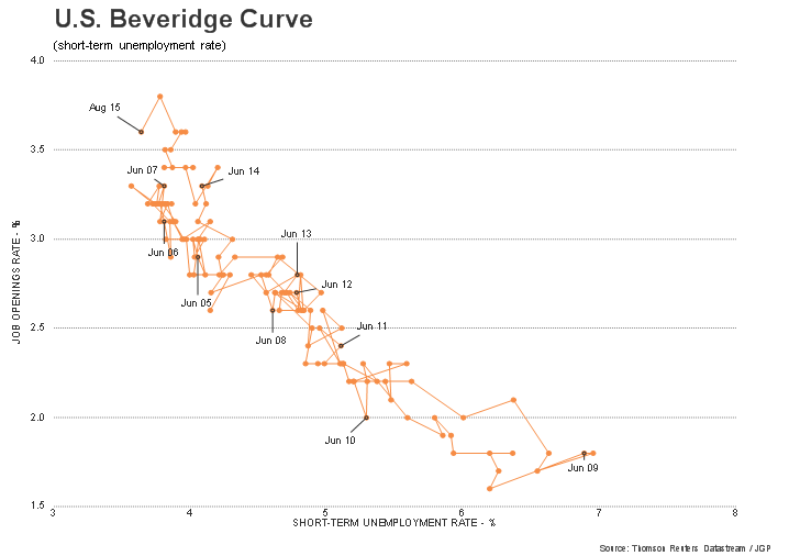
...but the bulk of the difference is long-term unemployment; short term unemployment rate is close to the previous cycle low (2007); interestingly short-term unemployment rate seems to have stalled at current low levels.


US Univ. of Michigan Sentiment: up sharply in October, fully recovering from lats month's drop

Posted on October 16th, 2015

Main takeaways:
  • Preliminary Michigan Sentiment up sharply in October, fully recovering from lats month's drop.
  • This rebound was important - it shows consumers shrugged off volatility and equity prices drop in the last couple of months.
  • Sentiment improved mostly among the bottom two-thirds of income distribution.
  • Historical episodes show that real consumption grows in the 2.4%-4.6% range while Sentiment is near current levels.
  • 5-10y inflation expectation ticked down a bit, but remains broadly sideways.


Additional highlights in the report:
  • "...renewed confidence did not simply represent a relief rally, but reflected renewed optimism"
  • "personal financial expectations rose to their highest level since 2007"
  • "most of the recent gains were among households in the bottom two-thirds of the income distribution"
  • "net income gains were reported by the highest number of households with incomes in the bottom third in the past ten years"
  • "two-thirds of all consumers reported hearing news of negative economic developments in early October, unchanged from September"
  • "consumers held the least favorable prospects for the unemployment rate in more than a year"
  • "all of the weakening job prospects were reported by middle income households"
  • "declines in prices helped all households, especially among lower income households" [meanwhile the Fed is trying to change that...]

The preliminary reading for October's Univ. of Michigan Sentiment rebounded from September (92.1 vs 87.2).


Looking closer at the relationship between Michigan Sentiment and household consumption:
The chart below plots the 3mma of Michigan Sentiment in the x-axis and real consumption (3mma, YoY) in the y-axis. The vertical black line shows the most recent monthly print. The expected growth rate of consumption based on the latest Sentiment reading would be close to 3.3%.

Perhaps even more important, the current level of Sentiment is compatible with consumption growth in the 2.4%-4.6% range, with a few outliers above this range and no episode of consumption growth below 2% in the vicinity of the current level for Michigan Sentiment.


Inflation expectations ticked down a bit.


US Industrial Production: still weak (Sep/2015)

Posted on October 16th, 2015

Main takeaways:
  • Industrial production rebounded in the third quarter but the overall picture is still weak.
  • ISM / Markit surveys and Conference Board leading indicator do not suggest upside for industry in the near term.
  • The diffusion index is a silver lining. It suggests the worst may be behind.
  • But, renewed weakness in oil sector and strong dollar could continue to weight on industrial activity.


US industrial production is currently at the same level it was in October/14 (red line in the chart below). An important part of the industrial production growth in 2012 to 2014 was driven by the energy sector and, to a lesser extent, by vehicle production. The chart below illustrates this point: core industrial production (blue line -- excluding energy, vehicles and high-tech) remained flat from late 2011 until 2013 while total industrial production drifted upwards.

In 2014 industrial production moved up substantially, but in the last three quarters both total IP and core IP have flattened out.


The chart above shows that industrial production rebounded a bit in the third quarter compared to the previous one (right-side chart).
What about the fourth quarter? Can we expect any improvement?

The manufacturing surveys (ISM, Markit) do not suggest upside for IP in the near term.

A simple linear regression suggests IP likely to remain weak.

Markit PMI has a shorter story, but the message is similar to the ISM

The Conference Board leading indicators are also catching down with weak industrial activity.


The diffusion index of industrial production is the only silver lining. It has improved in the recent months and often leads the overall IP growth by a few months, suggesting an improvement until early next year.

On the negative side...

... renewed weakness in oil sector could again spillover to other manufacturing sectors, similar to what happened earlier in the year.

...and the dollar strengthening continues to weight on industrial activity.


Atlanta Fed Wage Growth Tracker: down to 3% in September

Posted on October 15th, 2015

The Atlanta Fed has developed a measure of wage growth using microdata from the CPS. For details see Wage Growth Tracker. Wages have slowed down in the last three months, from 3.2% in June to 3% in September. The male and female wages have diverged recently, but the overall trend since 2010 is clear: up!


The chart below shows that the (3mma) median increase in wages for individuals working in September 2014 and September 2015 was 3.0%, and compares with the most common measures of wage growth.


US Inflation 1-1 with oil prices in the last 10 years

Posted on October 15th, 2015

The chart below plots oil prices vs CPI inflation for the last 10 years. One can see that there is a close association.


Indeed, using only oil prices one could have forecast the recent prints of CPI inflation.


Meanwhile, consumer prices excluding energy (and food) are very close to the median observed in the last 15 years (shades in the chart below are 1 and 2 standard deviation). And this happens despite the strengthening of the US dollar.


So, why is everyone worried about deflation / lowflation in the US?


US Inflation chart pack - are we there yet? (Sep/2015)

Posted on October 15th, 2015

Fed's criteria for raising rates:

"The Committee anticipates that it will be appropriate to raise the target range for the federal funds rate when it has seen further improvement in the labor market and is reasonably confident that inflation will move back to its 2 percent objective over the medium term."

So Fed needs to be reasonably confident inflation will move back to 2%. Are we there yet?

No. Recent Fed comments suggest the Fed is increasingly worried about downside risks to inflation (due to oil prices, strong dollar, slowdown in some recent economic data).

Consumer inflation is not there yet, but inflation momentum (3-month annualized inflation) is hovering around 2.0% in the last three months to September.

The chart below shows that CPI excluding energy is growing at 1.9% for 2 years -- with no sign of an impact of the stronger US dollar on overall price level. It is very hard to infer an slowdown in price increases from the chart below.


The reason for the steady pace of overall inflation (ex energy) is that services prices are increasing at a healthy 2.7% yoy (and 2.5% in the last 2 years). This is not far behind where core services were before the recession.

Housing prices (rental and OER) represents 33% of CPI and is increasing at 3.2% yoy.

See the detailed chart pack below.

Core inflation momentum moved from 1.5% in Jan to 2.4% in June and down to 2.0% in September. (2% in the last three prints - July, August, September).
Trimmed-mean CPI -- mentioned in the minutes -- moved from 1.2% to 2.1% and then to 1.9% in the same comparison.


The chart below looks at the average of the three measures of core inflation over a longer time span. Despite all the talks of deflation / lowflation, annual core inflation has barely moved since late 2011.


Core CPI at 1.9% and CPI ex energy at 1.8%.


It's all about energy...


...and goods. Services inflation running at a healthy 2.7%


Oil prices are spilling over to core. Core inflation excluding airfares is a bit higher. Looking at this chart it is hard to understand the Fed's fears of inflation remaining low...


Gasoline prices down again


Sticky-Price CPI growth remains stable -- a sign of anchored expectations

The Atlanta Fed produces a breakdown between 'sticky' vs 'flexible' prices and they argue 'sticky' prices (which is a weighted basket of items that change prices relatively slowly) "appear to incorporate expectations about future inflation to a greater degree than flexible prices".

The chart below shows that 'sticky' prices remain...well, sticky at around the 2% level annually. Moreover, sticky prices inflation is down but is running very close to 2%. This is in clear contrast to the 2009 to 2011 period which clearly showed concerns about future inflation.


Market-based inflation compensation is falling...this moves with oil prices and FOMC decided to downplay this by move late 2014.


FOMC minutes: all we need is confidence...but we only get uncertainty

Posted on October 8th, 2015

Minutes confirmed my preliminary assessment after the statement and press conference: "The Fed has not materially changed the outlook, neither the balance of risks, but has acknowledged an increase in uncertainty. And if one is not willing to show this uncertainty in the forecasts, you show it by lowering the 'dots' when your forecast suggest otherwise, and sound dovish".

Main takeaways from September minutes:
  • Decision to be on hold explained:
    • All but one member agreed developments over the intermeeting period had not materially changed the outlook.
    • But, "in part because of risks to the outlook for economic activity and inflation" they decided it was prudent to wait for additional information to bolster their confidence on inflation returning to target.
  • Wait a minute: didn't they write that the balance of risks had remained unchanged?
  • But the minutes make it clear: The balance of risks has not changed. But the risk of risks has! (in other words, uncertainty) - This was the missing information in the statement and press conference...(see Frank Knight for the difference between risk and uncertainty).
  • Members agree that unemployment rate is at a level "quite close to" NAIRU.
  • Not quite there yet:
    • many members think labor market conditions met or would soon meet one of the Committee's criteria for liftoff.
    • but some members indicated confidence on returning inflation to target had not increased (because global economic and financial developments)
  • Most members need to see growth to "continue to expand at moderate rate" and labor market conditions to "improve further" for them to increase their confidence on inflation returning to target.
  • So when to move?
    • Many members expect conditions to be met later this year.
    • But several members were concerned about downside risks to growth and inflation.
    • A couple of members expressed unease with decline in market-based measures of inflation compensation. (Yellen seems to be one of them, based on her remarks in the Q&A)
  • Yellen seems to be on the very dovish side of the debate. And she's the boss.
  • Some of the comments that the September decision had been a 'close call' were not evident in the minutes. At least among voters (Williams included), all but Lacker easily agreed to wait for more information.
  • Meeting-by-meeting and data dependency continues to hold...


US September Payroll -- weakness in manufacturing spilling over to services?

Posted on October 2nd, 2015

Main takeaways:

  • Very weak report, across the board; median expectations for private employment growth averaged 204k in the last three months and the actual number was 138k (lowest since mid-2012, right before QE3... if only Bernanke was there... :-)
  • Job creation in goods sector had already been weak since earlier this year, but job creation in the services sector slowed materially in the last couple of months.
  • Is this the spillover from the industrial sector (oil, exports, etc.) into the services sector or just a temporary halt in new hiring due to global uncertainty?
  • Low unemployment claims suggest layoffs are not increasing and a combination of measures of labor market activity (see below) suggest it might be the later.
  • The contradictory message in this report is that, while job creation has slowed, measures of labor slack kept shrinking.
  • Particularly worrying it the decline in labor force participation (LFPR), which seems to be back to the trend observed from 2010 to 2013 (LFPR stabilized in 2014, a year in which labor market improved materially).
  • If LFPR remains flat a mere 145k/month payroll for the next 15 months is needed to reach the 2016 median unemployment forecast; if employment growth slows from the current 2.2% to 1.5%yoy and LFPR remains constant (against structural trend), then unemployment rate would reach 4.5% by the end of 2016. Allowing the LFPR to continue its down trend since 2010, 145k/month would lead unemployment rate to 3.8% by the end of 2016.
  • As for the timing of liftoff...who knows... the Fed keeps hinting at December but, fears of a more serious growth slowdown in the US has now been added to the China risk and tightening of financial conditions. Since I believe the payroll slowdown is temporary and that global risks are likely to recede in the coming months, I think December is still the most likely date for moving out of the ZLB.

Establishment report:

Private payroll increased 118k in August, well below the bloomberg consensus again. Net revisions were negative 69k.

The table below shows the expected range for private payroll (excluding outliers), the monthly surprise and revisions to the last 3 months. The actual print is in "red" (an "x" when inside the expected range and a box when outside).

There were 4 large negative surprises in the last 18 months: Aug/14, Mar/14, Aug/15, and Sep/15.

Market has clearly missed the pace of job creation in the last 3 months!

One can see that the average of the median expectations for the last 12 months was 219k/month, very close to the actual releases of 218k/month in the same period (after revisions, private payroll averaged 217k/month in the last 12 months).

In the last 6 months the median expectations averaged 214k/months and the actual release averaged 194k (179k/month after revisions).

In the last 3 months the median expectations averaged 204k/m and the actual release averaged 156k/month (138k/month after revisions).


Measurement error in August?
After August disappointment, a strong emphasis was given to the fact that, since 2009, August payroll had always been revised higher (see chart) -- but the opposite happened this time.

The trend in private payroll (proxied by the 12-month moving average) moved down to 217k/month from 232k/month (unrevised) in August. The chart below shows the current vintage (orange line) as well as the real time path observed in each of the last few months.

The chart below shows that annual growth rate in private payroll is growing at 2.2% yoy -- off the highs but is still a healthy pace of growth.


September annualized growth (1.2%) is close to the recent lows -- which in the recent past proved to be transitory. The current yoy growth (2.2%) continues very close to the growth observed in private payroll in the last 3 years, which is above the peak observed in March/2006 during the previous expansion period and is closer to the growth rate observed in the late 1990´s.

Labor input:

The volume of total hours worked in the economy contracted in September resulting in an annualized contraction of 0.4% in the last 3 months (blue line in the chart below). This is well below the main trend (since Oct/09) which remains at 2.3%. There were several episodes of a similar sharp slowdown in total hours worked since the crisis: Oct/10 to Jan/11, Jan/12 to Jul/12, Feb/13 to Jul/13, Nov13 to Feb/14, Dec/14 to Apr/15, and the last one starting in June.


Contraction in mining and weak manufacturing are behind the stagnation in hours worked in the goods sector.
Hours worked in the services sectors slowed down a bit.


Wages:

Wages (average hourly earnings) were flat in September.
Wages for all employees rose by 2.2% yoy and for production worker rose 1.9% yoy - stable compared to August. Overall, as the chart below shows, average hourly earnings have consistently grown at about 2% p.a in the last three years.


Household income:

Total payroll income for production workers contracted sharply in September (-3.6% ar). For all employees, payroll income dropped 2.9% annualized in the month. Payroll income in the goods sector was negative in a quarter for the first time since 2010.


Below the breakdown in goods and services sector.


Household report:

The labor force participation rate moved 'sharply' down in June to 62.4%, breaking what had appeared to be a stable level. It is interesting to highlight that the most LFPR managed to do was to stabilize in 2014 -- a year in which job creation and labor market conditions improved quite substantially. Will LFPR resume its structural downtrend now that the economy appears to be weakening? This is a crucial question as it could put the Fed in a position where they see labor slack shrinking further at the same time that the economic growth slows.

The broader measure of unemployment (U-6), which includes marginally attached, discouraged workers, and employed part time for economic reasons is falling faster than the headline unemployment -- more on that in the spider charts below.

The median forecast for unemployment rate in the Fed's SEP (Summary of Economic Projections) is 4.8% for 2016, 2017 and 2018. Assuming a flat LFPR, a forecast of 4.8% unemployment rate by the end of 2016 is compatible with average employment growth of 145k/month, even lower than the 167k/month of total payroll observed in the last 3 months (which was way on the weak side -- if a recession does not happen).


As a reference, even a slowdown in employment growth from 2.2% currently to 1.5% yoy (the floor observed since mid-2011 was 1.8% yoy) would be equivalent to monthly employment gains of 178k and this would lead to a 4.5% unemployment rate by the end of 2016. Bottom line: LFPR needs to rebound (or job creation to settle at a very low level) for a 4.8% unemployment forecast to be attainable.

See detailed charts below:


The chart below shows unemployment rate (and short-term unemployment) and the recent tightening cycles (yellow). The short-term unemployment rate is at the lows.

Long term unemployment rate is improving faster. Moreover, the 'shadow' labor (i.e., the gap between U-6 and the headline unemployment rate) is improving faster in the recent months. This is a clear sign that the labor market continues improving.


Spider charts:

The two spider charts use 13 measures of labor market activity. The first chart shows how far away the labor market is from conditions that prevailed when employment was at its postrecession low and how close to conditions that prevailed when employment was at its prerecession peak. The second chart converts the upward trending indicators in the first chart to rates. (Source: Atlanta Fed -- details here)

The charts below compare the 13 measures of labor market in July/2015 and Sept/2015. It shows that, despite the sharp slowdown in net job creation in the last two months (payroll), the overall market conditions improved in the period. Note also that Yellen's preferred measures of labor market utilization (e.g., part time for economic reasons, marginally attached) continued to improve in the last couple of months.

Levels chart:

Rates chart:


September employment by category - chart pack

Posted on October 2nd, 2015

The charts below show employment by category. The blue line is total employment in the category, the orange bar is monthly change and the red line is the linear regression in the last two years.

Total payroll increased 142k in September, after a 136k growth in August (which was revised down from 173k). The trend for the last 6 months slowed from 280k/month by the end of last year to 200k in the 6 months to September.

Private payroll increased 118k in September, after 100k growth in August (revised down from 140k).
The trend for the last 6 months slowed from 270k/month by the end of last year to 180k in the 6 months to September.

Most of the slowdown in the pace of job creation was initially concentrated in the goods producing sector (mining and manufacturing), but it seems that this slowdown is now spreading into the services sector. Overall, the 6-month pace of job creation in the goods sector slowed from 50k (at the end of last year) to close to zero, while in the services sector it slowed from 220k to 180k in the same comparison.

Employment categories
Total nonfarm
Total private
Goods-producing
Mining and logging
Construction
Manufacturing
Private service-providing
Trade, transportation, and utilities
Wholesale trade
Retail trade
Transportation and warehousing
Utilities
Information
Financial activities
Professional and business services
Temporary help services
Education and health services
Educational services
Health care and social assistance
Leisure and hospitality
Other services
Government


Total nonfarm (trend from 242.8 to 243.9 to 242.7/m)


Total private (trend from 238.2 to 238.2 to 235.6/m)


Goods-producing (trend from 39.7 to 37.5 to 34.8/m)


Mining and logging (trend from 0 to -0.5 to -1.1/m)


Constructions (trend from 23.9 to 23.2 to 22.4/m)


Manufacturing (trend from 15.8 to 15 to 14.1/m)


Private service-providing (trend from 198.6 to 200.8 to 200.8/m)


Wholesale trade (trend from 8.3 to 8.2 to 7.9/m)


Retail trade (trend from 24.2 to 24.1 to 24.0/m)


Transportation and warehousing (trend from 13.0 to 12.7 to 12.4/m)


Utilities (trend from 0.6 to 0.6 to 0.7/m)


Information (trend from 3.9 to 3.9 to 3.9/m)


Financial activities (trend from 10.7 to 11.4 to 11.6/m)


Professional and business services (trend from 52.9 to 53.5 to 53.7/m)


Temporary help services (trend from 12.3 to 12.2 to 11.9/m)


Educational services (trend from 4.5 to 4.6 to 4.2/m)


Health care and social assistance (trend from 36.1 to 37.8 to 39.1/m)


Leisure and hospitality (trend from 37.4 to 37.2 to 37.1/m)


Other services (trend from 6.9 to 6.6 to 6.2/m)


Government (trend from 4.5 to 5.7 to 7.0/m)


Paulo Gustavo Grahl, CFA

Random comments on macro data. Views are my own. Except when they aren't.