Showing all posts tagged #national-accounts:


US 1Q16 GDP (second release): the good and the bad

Posted on May 27th, 2016

Main takeaways:

The good:
  • Overall 2% yoy growth is good given the headwinds the energy sector, strong dollar and tighter financial conditions in 2015.
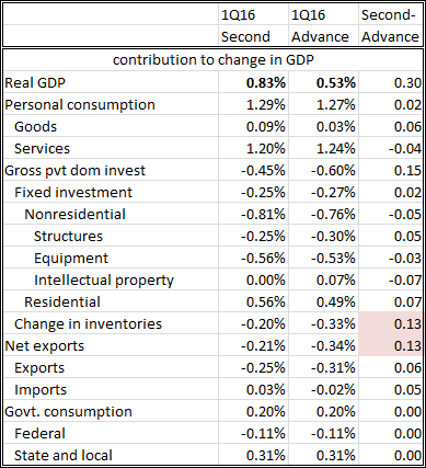
  • 1Q GDP revised up three tenths to 0.8%.
  • First released of real GDI at a strong 2.2% and 4Q15 was revised up by 1 percentage point to 1.9%.
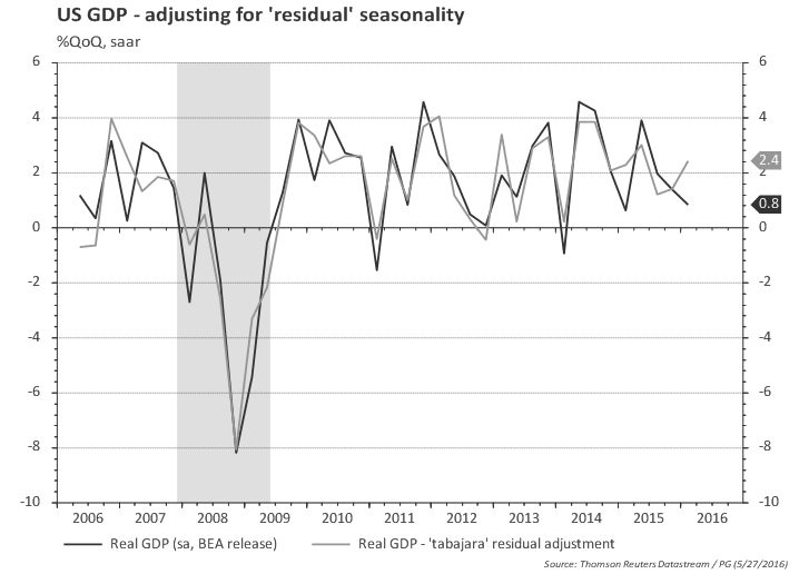
  • Adjusting for 'residual' seasonality would lead to a materially higher growth in 1Q (2.4%), more in line with the income report (GDI).
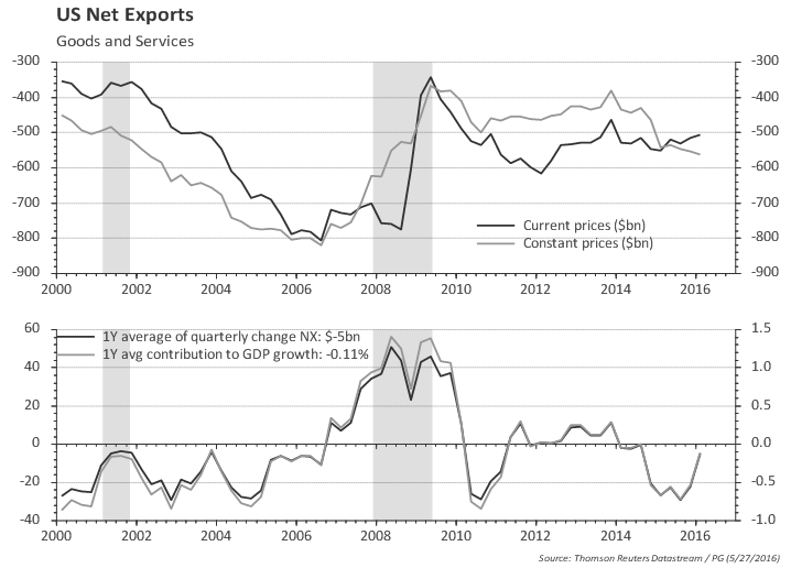
  • Net exports appear to be improving, after subtracting more than 0.5 percentage points from 2015 growth.
  • Residential investment is performing quite well.

The bad:
  • Growth in 2Q15 was 3.9% so there is a high hurdle for keeping annual GDP at 2%.
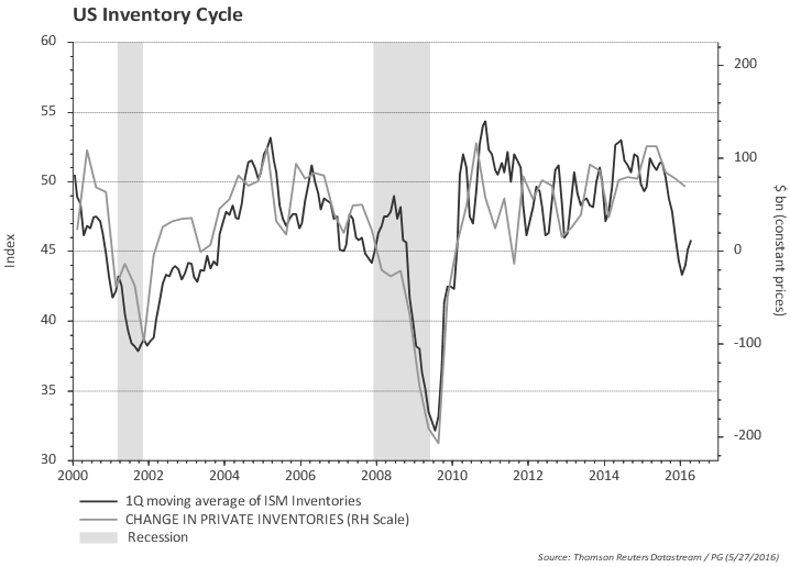
  • ISM suggest the inventory cycle is not complete. Change in inventories will likely to continue subtracting from growth.
  • Household consumption slowed down materially (but there's some hope it will rebound, based on the latest retail sales report).
  • Non-energy related investment slowed down substantially in the last two quarters. Is the energy crisis spreading to other sectors ? Most recent durable goods report does not show any substantial improvement in capex.
  • Discretionary spending slowed down in the last few quarters, and this often is a bad omen for future growth.


Outline of the rest of the report:
- GDP second release vs. advance
- GDP vs. GDI
- GDP Plus
- Discretionary spending
- 'Residual' seasonality
- Inventory cycle
- Chart pack -- full details


GDP second release

First quarter GDP revised up three tenths to 0.8%; first release of real GDI at a strong 2.2% and real GDI for the 4Q15 was revised up by 1 percentage point to 1.9%.


GDP and GDI

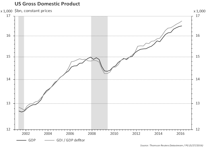
Both measures -- Gross Domestic Product and Gross Domestic Income -- should be equal (income = expenditure) but the data sources used to produce them are different and there is no effort to reconcile them, thus both contain valuable information. GDP uses the final expenditure approach and GDI is measured using the income approach. GDI is not available at the time of GDP's advance release and often gets relegated to a secondary role, although some researchers point to GDI as a better gauge of the economy (e.g., Nalewaik, J.J. (2010), “The Income- and Expenditure-Side Estimates of U.S. Output Growth," Brookings Papers on Economic Activity, 1, 71–127).

The chart below plots both GDP and GDI. Interesting to note that GDI was flat ahead of the last recession while GDP was still trending up -- so, in that case, GDI provided a better heads-up for the incoming recession.

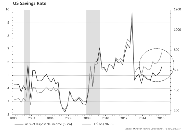
Another way of looking at the discrepancy between income and expenditure is to look at household savings rate. Consumers held off buying despite healthy income gains.


GDP Plus

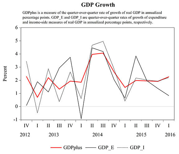
An estimate of growth using both GDP and GDI is produced by Aruoba, Diebold, Nalewaik, Schorfheide, and Song (ADNSS) and is called GDP Plus. The authors view GDP and GDI as noisy measures of the underlying latent true GDP. Their results are published regularly in the Philadelphia Fed web page. GDP Plus tends to smooth the quarterly changes. The reading for GDP plus in 1Q16 was 2.3% vs the 0.8% in the second GDP print.


GDP: looking at discretionary spending

Discretionary spending often slows down ahead of a recession, and given the weakness in some recent economic and financial indicators at the turn of the year, it is interesting to look at some charts to gauge the behavior of discretionary spending.

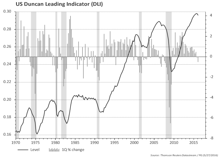
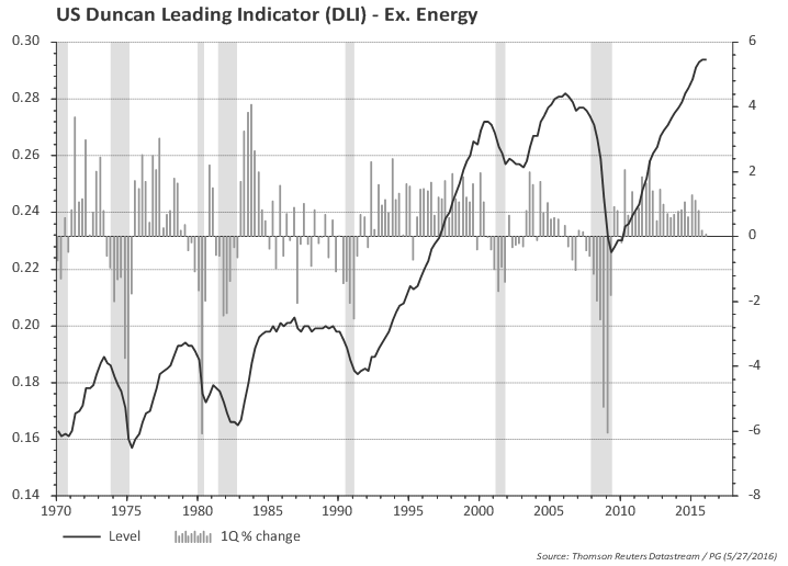
The ratio of growth in spending on consumer durables and private investment to final sales growth (the "Duncan" indicator) is a useful indicator. The chart below shows that this indicator usually turns down before the recession (shaded areas in the chart). The first chart considers total private investment and the second excludes investment in the energy sector. Both suggest discretionary spending slowed down. The indicator ex. energy has not consistently turned down, but it bears watching.

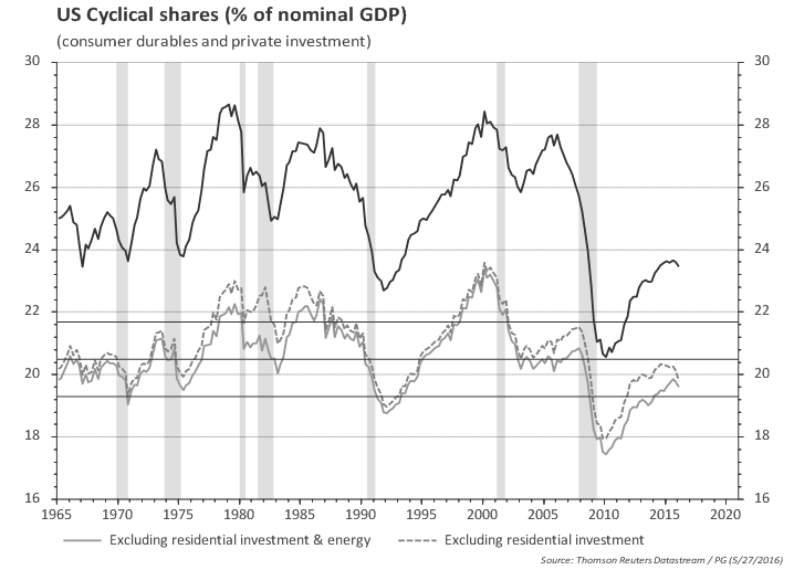
Another way to look at discretionary spending is to look at the share of the income spent on those items. The chart below highlights that consumption of durable goods and investment is still at low level as a share of income. Even excluding residential investment, it seems that there would be room for the share of discretionary spending in total income to grow. Nevertheless, it has turned south since early 2015. Even when one excludes energy, there is a down tick in both 4Q15 and 1Q16 that is important to monitor.


GDP 'residual' seasonality

Regarding 'residual' seasonality one can make a very simple adjustment by applying a simple seasonal filter to BEA's published GDP statistics. As the chart below shows, that would move 1Q GDP from 0.8% to 2.4%, more aligned with the growth of GDI reported earlier.


Inventory Cycle

The ISM data still hints at further downside to growth coming from inventory adjustment.


GDP Chart pack

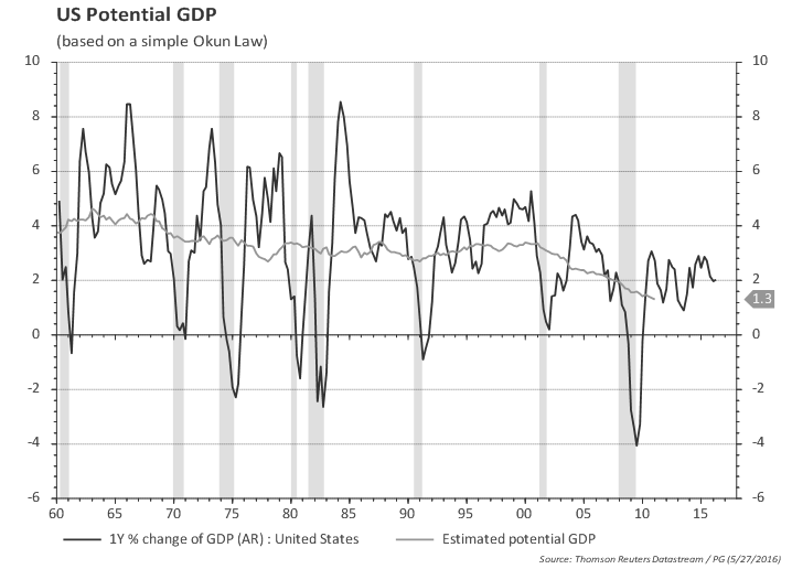
GDP growth not stellar, but is running above potential...
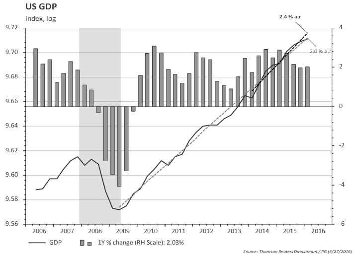
GDP increased 2.0% yoy in 1Q; trend in the last 2 years is 2.4%; 2Q last year was 3.9% so there is a high hurdle for keeping annual GDP at 2%.

GDP and real GDI (gross domestic income) are both growing at around 2% yoy.


GDP excluding inventories is growing at 2.3% in the last 2 years and 2.3% yoy
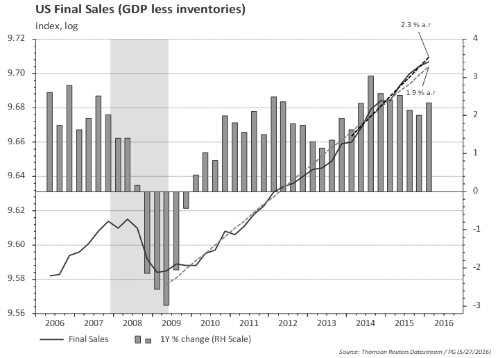

The value of goods and services purchased by US residents (regardless of where goods and services were produced) excluding inventories is growing at a healthy 2.7% since 2014.


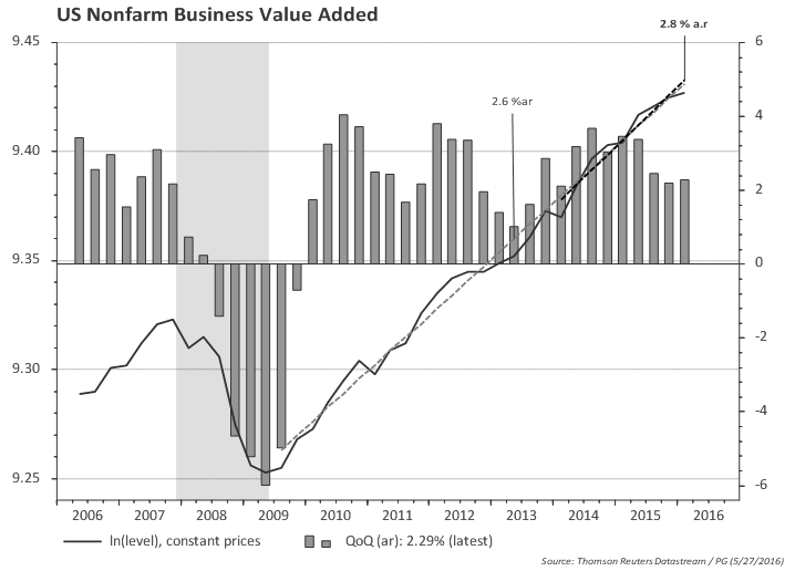
Business value added slowed to 2.3% in Q1, but overall growth since 2014 is 2.8%.

GDP breakdown: Consumption

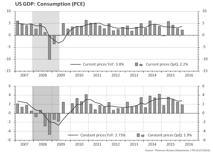
Consumption is growing at 2.7% yoy (constant prices)
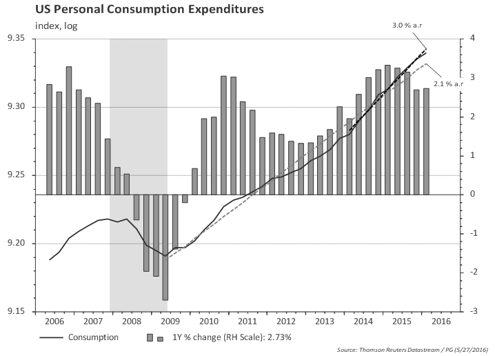


Core consumption (excluding energy and food) is even a bit higher.


GDP breakdown: Investment
The annual pace of investment growth is slowing materially...
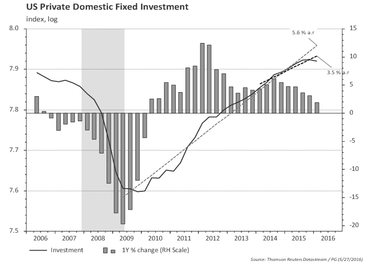

...and the slowdown spread to other areas outside the oil sector in the las two quarters (average 2% growth)
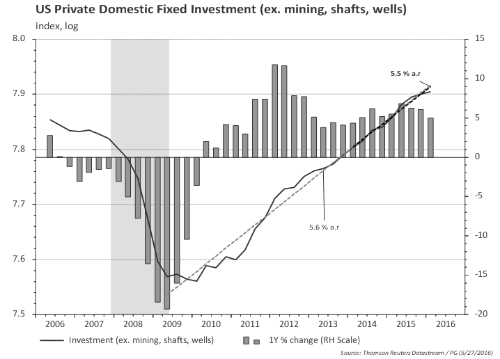
Excluding residential investment, one can see more clearly the slowdown in investment spreading to non-energy sectors.


GDP breakdown: External trade

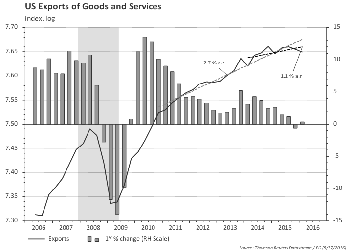
Exports flat, likely due to global growth slowdown and dollar strengthening...


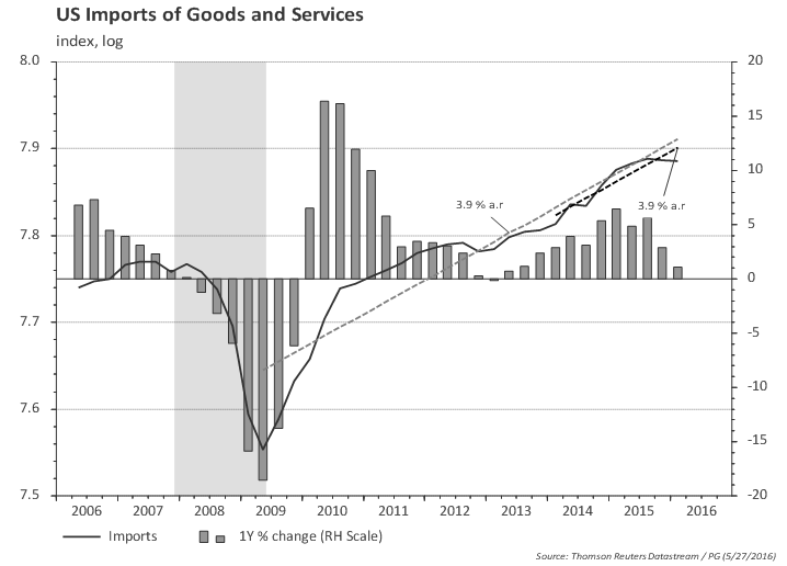
...while imports slowed down substantially in the last few quarters, since the slowdown in investment was combined with slowdown in consumption in the last two quarters.

Is the worst over for net exports?


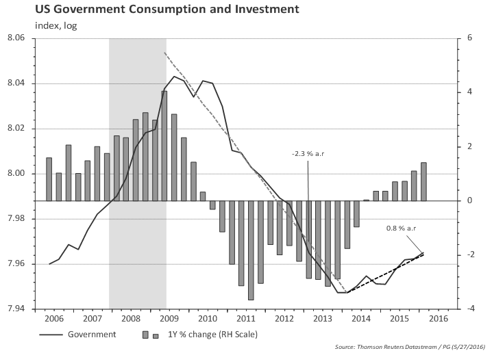
GDP breakdown: government

Government consumption and investment bottomed in 2014 and will likely continue to add to growth next year.


US 3Q15 GDP (third release): looking for signs of a turning point

Posted on December 22nd, 2015

Main takeaways:
  • The third release of 3Q GDP didn't change the overall picture.
  • Given the weakness in some recent economic and financial indicators it is important to track credit and discretionary spending for signs of a turning point.
  • The current 2% pace of GDP growth is still likely enough to reduce labor market slack.
  • Domestic demand is growing at a healthy 3%; household consumption also growing at 3%.
  • Investment (ex. oil) is growing at 6% pace.
  • Government consumption and investment bottomed in 2014 (after being a drag in the 2011-2013) and will likely continue to add to growth next year.


GDP revised down a tenth to 2.0%; real GDI revised down four tenths to 2.7%.
Third quarter GDP was revised down by 0.1pp, a bit better than market consensus. The small downward revision to the percent change in real GDP primarily reflected a downward revision to private inventory investment.


GDP: heading towards recession?

Given the weakness in some recent economic and financial indicators, it is interesting to look at some charts that historically have shown turning points in the economy.

The flow of credit to the economy (as a share of GDP) often -- but not always -- peaks ahead of or coincidently with recessions. The chart below shows that, overall, credit flows are at a relatively modest pace for both corporates and households (compared to the history since 1970). Nevertheless, the pace of credit creation has slowed for households since 1Q and nonfinancial corporates since 2Q. Bank lending data at a higher frequency (weekly) does not suggest a material slowdown in credit, but this bears watching given the sharp widening of HY spreads.

Another point worth looking is the strength in discretionary spending. One way to look at it is to calculate the ratio of growth in spending on consumer durables and private investment to final sales growth (the "Duncan" indicator). The chart below shows that this indicator usually turns down before the recession (shaded areas in the chart). The first chart considers total private investment and the second excludes investment in the energy sector. So far discretionary spending is not signaling an impending recession.


Another way to look at discretionary spending is to look at the share of the income spent on those items. The chart below highlights that consumption of durable goods and investment is still at low level as a share of income. Even excluding residential investment, it seems that the share of discretionary spending in total income is low. Excluding housing and energy, one can see that the share of discretionary consumption/investment is still increasing.


GDP Chart pack

GDP is running above potential...

GDP increased 2.1% yoy in 3Q; trend in the last 2 years is 2.5%


GDP and real GDI (gross domestic income) are both growing at around 2% yoy.


GDP excluding inventories is growing at 2.5% in the last 2 years and 2.1%yoy


The value of goods and services purchased by US residents (regardless of where goods and services were produced) excluding inventories is growing at a healthy 2.9% since mid-2014.


Business value added slowed to 1.8% in Q3, but overall 2.6% growth trend is unchanged


GDP breakdown: Consumption

Consumption is growing at 3% (constant prices)


Core consumption (excluding energy and food) is even a bit higher.


GDP breakdown: Investment
The annual pace of investment growth is slowing...


...but recall that there is a collapse in investment in the oil sector.


Excluding oil sector, overall investment picture is improving, with annual growth rates at 6%. Note that this is not far away from the pace of investment growth before the great recession.


GDP breakdown: External trade

Exports slowed materially, likely due to global growth slowdown and dollar strengthening...


...while imports are growing at a healthy 5% pace.


GDP breakdown: government

Government consumption and investment bottomed in 2014 and will likely continue to add to growth next year.


US Personal Income and Outlays in October: income growing fast; consumption slowdown due to energy

Posted on November 25th, 2015


Main takeaways:

  • Income and spending trends broadly unchanged when comparing to the previous report.
  • Slowdown in consumption in September/October is due to energy:
    • Consumption of energy goods and services dropped 8.9% (not annualized) since August.
    • Excluding energy, consumption rose 0.6% in the two months (3.8% annualized).
  • Consumption and income seem to have weathered well the spike in financial conditions.
  • Nominal (real) disposable income trend growth in the last 12 months growing at 4.2% (3.4%) and consumption trend growth at 3.7% (2.8%).
  • Core nominal (real) consumption (ex food and energy) growing at 4.5% (3.2%) in the last 12 months.


Personal consumption excluding energy keeps growing...
...in current prices...

...and volumes.

So the slowdown in the previous couple of months is entirely due to energy. This mirrors the conclusion I had when looking only at the narrower retail sales data (US Retail Sales -- trend remains unchanged.

Income and spending (ex energy) are growing at roughly the same pace. But the slower pace of growth in total consumption (including energy) means savings rate is increasing.


Disposable income seems to be in a steady trend, while household consumption rebounded from the lows early in the year and is back to its previous trend growth.

Chart 1a) Income and expenditures, nominal, since 2010


The growth trend in the last 12 months for disposable income rose to 4.2% in October (3.3% in September and 3.1% in June), while the growth trend for consumption moved up to 3.7% (from 3.6% in September and 2.6% in June).

Cart 1b) Income and expenditures, nominal, last 2 years


Chart 2a) Income and expenditures, volume, since 2010


When looking at volumes (constant prices) the trend growth in real disposable income rose to 3.4% in October (from 2.9% in September and 3.2% in July), while real consumption slowed to 2.8% (vs 3% in September and 2.8% in July).

Chart 2b) Income and expenditures, volume, last 2 years


The chart below shows slightly different measures of income. Overall, all measures are growing at or above 5% in the last 6 months!

Chart 3a) Different measures / concepts of household income, since 2010


Chart 3b) Different measures / concepts of household income, last 2 years


The chart below shows that almost all the recent stagnation in consumption was due to 'energy' consumption.

Chart 4a) Household consumption, core vs total, nominal, since 2010


Chart 4b) Household consumption, core vs total, nominal, last 2 years


Chart 4c) Household consumption, core vs total, volumes, since 2010


Chart 4d) Household consumption, core vs total, volumes, last 2 years


Breaking household consumption into goods and services show that the recent soft patch was entirely due to goods consumption -- but take a look in the chart of volumes: it shows goods consumption growing faster than services.

Chart 5a) Goods and services consumption, nominal, since 2010


Chart 5b) Goods and services consumption, volume, since 2010


Digging further into goods consumption it is evident that most of the hit happened in nondurable (which includes gasoline), but when adjusting for prices nondurable goods seem to be back to the previous growth trend.

Chart 6a) Goods consumption (durables and nondurables), nominal, since 2010


Chart 6b) Goods consumption (durables and nondurables), volume, since 2010


Chart below focus only on nondurable goods (volume) to better spot the trends.

Chart 6c) Goods consumption (nondurables), volume, since 2010


A closer look at US corporate profits and cash flow (part 2) (updated with Q3 2015 results)

Posted on November 24th, 2015

Main takeaways:
  • Numbers below are for nonfinancial domestic corporate.
  • After tax profits are $953bn (+1.8% yoy).
  • Nonfinancial domestic corporate net cash flow has increased recently to $1.7tn (+2.4% yoy).
  • The profit measure more closely associated with S&P500 reported earnings ticked down in 3Q15, but is up by 5.6% since last year.


Charts below are for Nonfinancial Domestic Corporate sector -- the ones in "A closer look at US corporate profits and cash flow (updated with Q3 2015 results)" are for total US corporate sector.

Total nonfinancial domestic profits from current production currently at $1.3tn.

Below total nonfinancial domestic profits from current production after taxes.

Out of the $0.96tn $0.94tn in after tax profits, 60% 61.6% is dividends and 40% 38.4% ($390bn $358bn) is saved.

It is also possible to calculate cash flow -- which is undistributed profits puls depreciation less (net) transfers. It is a measure of internal funds available for investment.

The national accounts also provide a measure of profits after tax without IVA and CCAdj. This is the measure often used in comparisons with the S&P measures of reported earnings.


A closer look at US corporate profits and cash flow (updated with Q3 2015 results)

Posted on November 24th, 2015

Main takeaways:
  • After tax profits are roughly flat at $1.5tn (since 2012).
  • (Net) dividends paid to other sectors is close to its historical average (as a share of profits).
  • Corporate net cash flow has increased recently (from $2tn mid-2013 to $2.2tn).
  • The profit measure more closely associated with S&P500 reported earnings ticked down in 3Q15, but is up by 4% since last year.


Let's take a look at what is happening with US corporate profits. But before, allow for a brief digression on what is and what is not calculated in the US National Accounts statistics.

BEA's main measure of corporate profits is profits from current production. It provides a comprehensive and consistent economic measure of the income earned by all US corporations. It is unaffected by changes in tax laws, and it is adjusted for nonreported and misreported income.

Profits from current production is derived as the sum of (a) profits before tax ("book profits", based on tax-returns provided by the IRS; financial-accounting information is used for the most recent periods) , (b) inventory valuation adjustment (IVA), and (c) capital consumption adjustment (CCAdj).

IVA: gains or losses resulting from inventory withdrawals are not considered income from current production. The IVA converts business-accounting valuation of withdrawals from inventory to a current-cost basis by removing the capital gain or loss element that results from valuing these withdrawals at prices of earlier periods.

CCAdj: converts valuations of depreciation (based on tax code parameters) to valuations that are based on empirically based depreciation patterns, and convert the measures of depreciation to a current-cost basis by removing the capital gain or loss that arises from valuing the depreciation of fixed assets at the prices of earlier periods.

Profits from current production can be "national" (including net profits / transfers "originating in the rest of the world") and "domestic". The profits component of domestic income excludes the income earned abroad by US corporations and includes the income earned in the US by foreign residents.


From this digression I return with charts to illustrate the above mentioned components.

Total profits from current production currently at just above $2tn.

Below total profits from current production before and after taxes.

Out of the $1.5tn in after tax profits, 55% 57.5% is dividends and 45% 42.5% ($700bn $600bn) is saved.

It is also possible to calculate cash flow -- which is undistributed profits puls depreciation less (net) transfers. It is a measure of internal funds available for investment.

The national accounts also provide a measure of profits after tax without IVA and CCAdj. This is the measure often used in comparisons with the S&P measures of reported earnings. It ticked down in Q3 15 but the one-year trend is still up.


US GDP: follow-up on Q3 2015 result (GDP Plus @ 2.9% QoQ)

Posted on November 24th, 2015

Main takeaways:
  • Given recent concerns about seasonal adjustment and measurement problems, BEA has recommended looking at both GDP and GDI to infer the underlying state of the economy.
  • However, all the measures (GDP, GDI and GDP Plus) are currently showing a similar picture: an annual pace of growth just above 2%, slowing down from the 3% pace of late 2014.

The highlights of the second GDP release for 3Q15 are in the link:

As mentioned in the comment US GDP: BEA working to improve growth statistics, the statistics bureau is highlighting the usefulness of their estimate of Gross Domestic Income to get a better picture of the economy.

This approach is also taken by Aruoba, Diebold, Nalewaik, Schorfheide, and Song (ADNSS) and is called GDP Plus. The authors view GDP and GDI as noisy measures of the underlying latent true GDP. The latest report estimates GDP Plus at 2.9% in the third quarter (QoQ, saar) and 2.3% compared to last year.

See the charts below comparing GDP, GDP Plus and a equally weighted average of GDP and GDI (as recently started to be published by BEA). As an interesting side comment, the charts below show that the GDP Plus estimate slowed down ahead of the GDP estimate before the GFC.


US 3Q15 GDP (second release): revised up to 2.1% (from 1.5%); real GDI printed at a healthy 3.1% in the quarter and was revised up in Q2

Posted on November 24th, 2015

Main takeaways:
  • GDP is running above potential.
  • The good news is that GDI was revised up in Q2 (0.7% to 2.2%) and printed 3.1% in Q13 2015 and was revised up in Q2 (before revisions, GDI was running very weak -- a point which I mentioned as a concern last quarter).
  • The value of goods and services purchased by US residents is growing at 2.8%.
  • Fear of inventory overhang: too much ado... (details below).


Third quarter GDP was revised up by 0.6pp, close to market consensus.
As the table below highlights, the upward revision was mostly in inventories, partially offset by weaker net exports and services consumption.


US GDP increased 2.2% yoy in Q3; trend in the last 2 years is 2.5%

Domestic demand is growing at 2.8% yoy

The good news was that GDI was revised up; it appeared to be flat from Q4 2014 to Q2 2015 but that was revised away
Indeed, 2Q 15 GDI growth was revised up from 0.7% to 2.2% qoq and Q3 15 GDI initial print was 3.1% qoq.


The average of real GDP and real GDI increased 2.6 percent in the third quarter, compared with an increase of 3.0 percent (revised) in the second

Both GDP and GDI are growing at 2% yoy


Business value added slowed to 1.8% in Q3 15, but the overall 2.6% growth trend is unchanged

Inventories

There is a lot of concern regarding inventory accumulation in the US. JPM, for instance, wrote that
"The mix of growth, however, is now less favorable for Q4 GDP, as real final sales were revised down from 3.0% to 2.7%, while inventory building was revised up from a $57 billion pace to an unsustainably hot $90 billion rate. The bigger inventory overhang helps explain why manufacturing sentiment remains cautious early in the fourth quarter, and does present downside risk to our 2.5% estimate for current-quarter GDP growth."

There are indeed reasons to be concerned about short-term quarter-on-quarter growth outcomes. I have looked at inventory-to-sales ratio in manufacturing, wholesale and retail sectors, and the big jump observed from late 2014 into 2015 in all the sectors seem to be mostly related to the energy sector. Of course there are sectors in which inventory level is too high and will need to be adjusted. Clothing is an example. But I think that translating that concern into a big worry for the US economy may not be appropriate.

Let's take a look at the total economy.
The chart below shows that inventory accumulation in the Q3 2015 was 0.6% of final sales, which is elevated by historical standards (at least when comparing to the period of the great moderation).

So it may be the case that the pace of inventory accumulation slows down in the coming quarters. Since it's the change in inventory accumulation that impacts growth, it might be the case that inventories remain a drag to growth in the coming quarters. Indeed, the slowdown of inventory accumulation in the third quarter was already enough to subtract 0.6pp from growth (better than the initially reported drag of 1.4pp). If the current flow of inventory accumulation goes to zero over a one-year period, this would result in a drag of 0.8pp to GDP growth.

However, the actual level of inventories (as opposed to the pace of inventory accumulation) does not seem particularly high. The ratio of inventories to final sales (nonfarm inventories) did increase from 2.14 at the end of 2014 to 2.18 in Q3 2015, but the overall picture seems to be of a flat inventory to final sales ratio in the aftermath of the financial crisis.


A constant inventory-to-sales ratio at 2.18 would imply inventory accumulation of around $60bn, not very far from annualized pace of inventory accumulation observed in Q3 ($90bn). An adjustment to $60bn pace of inventory accumulation over a year would result in a small inventory drag to GDP growth of around 0.2pp over the same period.

US Personal Income and Outlays in September: strong consumption if you exclude energy

Posted on October 30th, 2015


Main takeaways:

  • Slowdown in consumption in September mirrors the slowdown earlier this year, since it is all due to energy:
    • Consumption of energy goods and services dropped 5.3% (not annualized) in the month.
    • Excluding energy, consumption rose 0.4% in the month.
  • Consumption and income seem to have weathered well the tightening of financial conditions.
  • Nominal (real) disposable income trend growth in the last 12 months growing at 3.3% (2.9%) and consumption trend growth at 3.6% (3.0%).
  • Core nominal (real) consumption (ex food and energy) growing at 4.5% (3.3%) in the last 12 months.

Personal spending and household income both rose 0.1% in September. Savings rate almost flat at close to 5% (the average observed since 2013).

Disposable income seems to be in a steady trend, while household consumption rebounded from the lows early in the year and is back to its previous trend growth.

Chart 1a) Income and expenditures, nominal, since 2010


The growth trend in the last 12 months for disposable income remained at 3.3% in September (3.2% in July and 3.1% in June), while the growth trend for consumption moved up to 3.6% from 3.4% in August (2.8% in July and 2.6% in June).

Cart 1b) Income and expenditures, nominal, last 2 years


Chart 2a) Income and expenditures, volume, since 2010


When looking at volumes (constant prices) the trend growth in real disposable income slowed to 2.9% in September (from 3.0% in August and 3.2% in July), while real consumption rose remained stable at 3% (2.8% in July).

Chart 2b) Income and expenditures, volume, last 2 years


The chart below shows slightly different measures of income. The green line shows private sector wages have clearly slowed down in recent months (from above average growth) and are now more aligned with the broader concept of disposable income. Overall, all measures are growing at close to 4% in the last 6 months.

Chart 3a) Different measures / concepts of household income, since 2010


Chart 3b) Different measures / concepts of household income, last 2 years


The chart below shows that almost all the recent stagnation in consumption was due to 'energy' consumption.

Chart 4a) Household consumption, core vs total, nominal, since 2010


Chart 4b) Household consumption, core vs total, nominal, last 2 years


Chart 4c) Household consumption, core vs total, volumes, since 2010


Chart 4d) Household consumption, core vs total, volumes, last 2 years


Breaking household consumption into goods and services show that the recent soft patch was entirely due to goods consumption -- but take a look in the chart of volumes: it shows goods consumption growing even faster than its recent growth trend.

Chart 5a) Goods and services consumption, nominal, since 2010


Chart 5b) Goods and services consumption, volume, since 2010


Digging further into goods consumption it is evident that most of the hit happened in nondurable (which includes gasoline), but when adjusting for prices nondurable goods seem to be back to the previous growth trend.

Chart 6a) Goods consumption (durables and nondurables), nominal, since 2010


Chart 6b) Goods consumption (durables and nondurables), volume, since 2010


Chart below focus only on nondurable goods (volume) to better spot the trends.

Chart 6c) Goods consumption (nondurables), volume, since 2010


US 3Q 2015 advance GDP: domestic demand at solid rates and net exports soft

Posted on October 29th, 2015

Main takeaways:
  • Strong domestic demand:
    • Consumption increasing at 3% yoy.
    • Investment slowed to 3.4% yoy -- but excluding oil sector, investment is up 6%yoy.
  • Government consumption and investment turned positive in 2014 and is up 0.7% yoy.
  • Net exports will likely continue to contribute negatively to GDP -- but in the recent US history, soft export growth was never associated with weak overall income growth.


US GDP increased 2% yoy in Q3.

Domestic demand (GDP excluding net exports and inventories) is growing at 2.8% yoy.


Private consumption rose 3.2% yoy - similar to the growth rate observed in the last 2 years.

Private investment slowed down to 3.4% yoy...

...but excluding the direct (accounting) impact of oil, investment is growing at 6% yoy.

Government consumption and investment turned positive in 2014.

Exports increased 2% on average in the last two years (and 1.5% yoy in Q3). The slowdown in export growth started in 2013, and precedes the strengthening of the dollar, which dates mid-2014.

Imports rose 4.8% on average in the last two years (5.5% yoy in Q3).

As a result of the slowdown in exports and strong imports, net exports became a drag to GDP growth, similar to what had happened from 2000 to 2006.


Looking at 5-year cycles, the strengthening of the broad dollar index (in real terms) suggests net exports will continue to be an accounting drag to growth.

At face value, this relationship suggests that, by late 2017, the 5-year average contribution of net exports to growth will be around - 0.4pp. Given the performance of the last 3 years, this would imply an average contribution of net exports of around -0.75 percentage points over the next couple of years.


The chart below shows that it is unusual for 2-year average contribution of net exports to GDP to be close to or lower than 0.75pp...


...and all those episodes of very negative net exports contribution were associated with very strong domestic demand.
A quick look at those episodes show that exports growth slowed down. In 1997-1999 period, for example, the US dollar was strengthening, US real exports were sideways, and imports were growing fast at the same time the US economy was very strong.


US GDP in 3Q shows domestic demand growing at "solid rates"

Posted on October 29th, 2015

Main takeaways:
  • GDP growth in Q3 at 1.5%, close to market consensus.
  • Inventories cut 1.4pp from growth in the quarter...
  • ...but quarterly swings in inventories have not changed overall growth path in the recent past.
  • Domestic demand growth is growing at "solid rates" -- to use the upgraded sentence in the FOMC statement.
  • Growth remains above potential => labor market likely to continue improving.

US GDP rose 1.5% in 3Q, close to bloomberg consensus. Consumption increased a healthy 3.2% (contributing 2.2 pp) and investment growing 2.9% (contributing 0.5pp). Domestic demand growth appears consistent with FOMC's description of "increasing at a solid rates in recent months".

Inventories were the main drag, cutting 1.4pp from growth in the quarter. The positive surprise was the flat contribution of net exports against an expected drag.


Inventory changes can be a key component of quarterly changes in growth, but they have not changed the overall trend. The charts below plot GDP and Final Sales (GDP less inventories) together with a trend since mid-2009 and a trend in the last two years.
Both GDP and Final Sales share the same 2.0% growth trend since the end of the recession and 2.5% growth trend in the last two years.


Important to highlight that current pace of growth appears to be above potential, therefore hinting that underutilization of labor resources would likely continue to diminish.


Paulo Gustavo Grahl, CFA

Random comments on macro data. Views are my own. Except when they aren't.