Showing all posts tagged #research:


US Inflation chart pack - are we there yet? (Aug/2015)

Posted on September 16th, 2015

Fed's criteria for raising rates:

"The Committee anticipates that it will be appropriate to raise the target range for the federal funds rate when it has seen further improvement in the labor market and is reasonably confident that inflation will move back to its 2 percent objective over the medium term."

So Fed needs to be reasonably confident inflation will move back to 2%. Are we there yet?

Consumer inflation is not there yet, but inflation momentum (3-month annualized inflation) is hovering around 2.0% in the last three months to August, a bit lower than in the previous months (note: there's a 0.5pp gap between CPI an the target PCE inflation).

The minutes of July's FOMC meeting (FOMC: moving closer, but with no conviction) showed an increasing concern with downside risks to inflation -- and this was before a further drop in oil and commodity prices and further strengthening of the dollar. Late last year, when oil prices were collapsing, the Fed (Yellen, Fischer) made the case that low inflation was not a big concern -- it is a lagging indicator, so the focus should be on labor market slack. More recently, the Fed appears to get cold feet about moving off the ZLB and inflation concerns are making a comeback. Moreover, headwinds (e.g. stronger dollar) could strength the doves' case.

See the chart pack below.


Core inflation momentum moved from 1.5% in Jan to 2.4% in June and down to 2.0% in August.
Trimmed-mean CPI -- mentioned in the minutes -- moved from 1.2% to 2.1% and then to 1.9% in the same comparison.


The chart below looks at the average of the three measures of core inflation over a longer time span. Despite all the talks of deflation / lowflation, annual core inflation has barely moved since late 2011.


Core CPI at 1.8% and CPI ex energy also at 1.8% (unchanged from July)


It's all about energy...


...and goods. Services inflation running at a healthy 2.6%


Oil prices are spilling over to core. Core inflation excluding airfares is a bit higher.


Gasoline prices down again


Sticky-Price CPI growth remains stable -- a sign of anchored expectations

The Atlanta Fed produces a breakdown between 'sticky' vs 'flexible' prices and they argue 'sticky' prices (which is a weighted basket of items that change prices relatively slowly) "appear to incorporate expectations about future inflation to a greater degree than flexible prices".

The chart below shows that 'sticky' prices remain...well, sticky at around the 2% level annually. Moreover, sticky prices inflation is down but is running very close to 2%. This is in clear contrast to the 2009 to 2011 period which clearly showed concerns about future inflation.


Market-based inflation compensation is falling...this moves with oil prices and FOMC decided to downplay this by move late 2014.


Will they or won't they -- headwinds for the FOMC

Posted on September 16th, 2015

  • The overall economic data released since Fed's latest meeting suggests the criteria for liftoff has been met.
  • However, headwinds from the recent developments abroad and tightening of financial conditions in the US will likely postpone the first hike.
  • The Fed has not elaborated upon the way it sees the balance of risks -- so we're flying blind.
  • The key rational for believing a hike will be delayed is that the Fed has not provided any 'heads-up'.
  • Charts below: dollar, commodities, financial conditions.

Charts


US trade-weighted dollar is higher than earlier in the year, when Fed warned about its negative consequences to the economy

Oil prices are also back to the lows of earlier this year

Retail gasoline prices are not at the lows but have trended down since July

Commodity prices have just made new lows


US equities are 7% down since mid August

Equity vol off the highs but still elevated

US 10y Treasuries

Baa spreads widened materially vs Aaa

Market-based inflation compensation sharply down, but this could just be oil prices

Financial conditions, as measured by GS, have already tightened sharply in 2015...

...but broadening the definition to include oil prices show a more benign picture

Financial conditions, as measured by the Chicago Fed, also show a tightening, but overall levels remain in the accommodative range

Adjusting for the business cycle, Chicago Fed index suggest that financial conditions moved to tight since the beginning of 2015

Below, some additional financial conditions and financial stress indices


US Retail Sales -- good; two in a row (Aug/2015)

Posted on September 15th, 2015

Main takeaways:
  • August: another good retail sales report -- two in a row after the latest FOMC meeting.
  • Small revisions to the previous two months were positive.
  • Growth resumed after the winter lull:
    • 12-month growth of total retail sales ex gasoline stations increased from 4.0% to 4.2%.
    • 12-month growth of the 'control group' increased from 2.4% to 3.1%.
    • Both are very close to the 4-year growth pace: a resilient consumer!
  • Inventory-to-sales ratio remained stable.

Another good retail sales report. Excluding sales at gas stations one can barely see the consumption growth scare that took place earlier in the year: total retail sales ex gas stations increased 4.2% in the last year compared to 4.5% in the last 4 years.


The chart below compares total retail sales with retail excluding gasoline sales. It is clear that most of the slowdown in retail sales earlier in the year was due to falling gasoline prices.


Looking at the "control group" (total retail excluding auto dealers, bldg materials, gas stations) a similar growth picture emerges: 3.1% growth in the last year and 3.0% in the last 4 years.


Revisions to the previous two months were positive.


Inventories: stable if one excludes gasoline sales (latest: July)


Extra charts

The charts below show retail and food services by kind of business. The red line is an index in log (averages zero in the period) so that a number 10 in the scale means sales are 10% higher than the period average. The red dashed line is the trend in the last 12 months and the blue bars (right scale) are the monthly percentage change. The headline is how the slope of the red dashed line has changed compared to last two months.


Last 12 months trend moved from 6.1% to 6.0% to 6.1%


Last 12 months trend moved from 5.0% to 5.7% to 5%


Last 12 months trend from -2.8% to -4.2% to -4.6%


Last 12 months trend moved from 0.9% to 2.3% to 1.7%


Last 12 months trend moved from 2.7% to 2.6% to 2.7%


Last 12 months trend moved from 1.9% to 2.6% to 3.4%


Last 12 months trend moved from -26.8% to -22% to -19.2%


Last 12 months trend moved from 2.1% to 3% to 3.6%


Last 12 months trend moved from 4.9% to 4.9% to 5.6%


Last 12 months trend from -0.4% to -0.3% to 0.8%


Last 12 months trend moved from 2.4% to 2.5% to 4.8%


Last 12 months trend moved from 4.5% to 5.8% to 6.7%


Last 12 months trend from 8.1% to 8.3% to 7.4%

FOMC forecasts...will be bullish! (sort of)

Posted on September 15th, 2015

Main takeaways:
  • Forecast for 2015 are likely to be bullish:
    • GDP growth might be revised upwards by 0.3pp
    • Unemployment rate likely to be revised down by 0.2pp
    • Core PCE likely to be revised upwards a bit or remain unchanged
    • Headline PCE likely to be unchanged
  • Forecasts for 2016, 2017 and the new 2018 forecasts are harder to guess. A gloomy view of world growth and further dollar strengthening could lead to lower growth and inflation in 2016 -- thus supporting lower dots.
  • Even if growth in 2016 and 2017 are not revised down, dots could move down due to 'headwinds'.
  • Recent talks and concern with low productivity could lead to a bit lower potential growth and lower longer run terminal interest rate
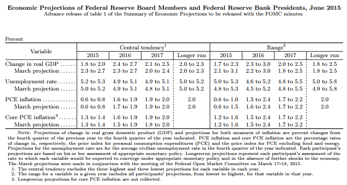
  • Fed will officially report the median forecasts (including median 'dots'). June median 'dots' were 0.625 for 2015 and 1.625 for 2016.


The table below shows the Fed forecasts as of June.

One interesting question is how the forecasts could change at the upcoming meeting.
Let's take a look:

GDP Growth:

By the time of June's forecast, the Fed knew first quarter growth had been -0.7% and market consensus for 2Q was around 2.5%. The 2015 year-end forecast, then, had an implied quarterly growth of in the 2.7% to 3.2% range for the second half of the year.

Since then, we learned that first quarter growth was revised up from -0.7% to +0.6% and that 2Q printed 3.7%. Keeping the same expected growth rate for the second half of 2015 would imply a large upward GDP growth revision to 2.4% to 2.7%(!) range, roughly back to where the forecasts were in March.

Such upward revision is not likely due to slower global growth, another hit to oil investment, stronger dollar, among others. However, even if growth in the second half is downgraded to 2% to 2.6% range, GDP growth forecast for 2015 is likely to be revised up by 0.3pp.

Unemployment:

By the time of June's forecast, the Fed knew unemployment rate had reached 5.5% in May. Its 2015 forecast implied an average drop of 0.3 to 0.5 pp (annualized) until year-end. Unemployment rate dropped by 1.6pp (annualized) in the 3-month period (Jun-Aug) and the latest reading (5.1%) is already below the central tendency range of 5.2% to 5.3%.
The odds are unemployment rate forecast will be cut back to March's forecast or even a bit lower.

Headline Inflation:

By the time of June's forecast, the Fed knew PCE inflation had printed 0.1% yoy in April and its 2015 forecasts implied inflation running in the 1.1% to 1.4% range until year-end. PCE inflation was 2.5% in the following three months (May-Jul).
Keeping the PCE inflation forecast would imply an average inflation in the 0.2% to 0.7% range from August to December. The most recent drop in oil prices have the potential to keep headline inflation at the low end of this range -- therefore its hard to guess whether headline inflation forecasts will be changed.

Core Inflation:

By the time of June's forecasts, the Fed knew Core PCE inflation had printed 1.2% yoy in April and its 2015 forecasts implied core inflation running in the 1.3% to 1.5% range until year-end. Core PCE inflation was 1.4% in the May-July period, in line with Fed's forecast. However, other measures of core inflation (trimmed mean PCE) and the reduction of unemployment rate suggest a higher pace of inflation in the coming months. Barring a further decline in oil prices, it seems 1.4% could be the floor in the coming months -- therefore the odds are core PCE will be revised a bit upwards.


Atlanta Fed Wage Growth Tracker: steady at 3.2% in July

Posted on September 10th, 2015

The Atlanta Fed has developed a measure of wage growth using microdata from the CPS. For details see Wage Growth Tracker.

The chart below shows that the (3mma) median increase in wages for individuals working in July 2014 and July 2015 was 3.2%, and compares with the most common measures of wage growth.


US - Employer costs for wages and salaries (2Q15)

Posted on September 9th, 2015

O BLS divulga uma pesquisa sobre os custos (wages, benefits) para o empregador, chamada ECEC (Employment Cost for Employee Compensation), que utiliza a mesma base da dados do ECI (Employment Cost Index) - a National Compensation Survey.

A principal diferença entre o ECI e o ECEC é que o ECI usa peso fixo para o emprego, de modo que o ECI mede a evolução dos salários sob a ótica do empregado (abstraindo das mudanças na composição do emprego), enquanto que o ECEC mede sob a ótica do custo para o empregador.

Os gráficos abaixo mostram que em ambas as métricas (ECI e ECEC) o primeiro trimestre pareceu excessivamente elevado e houve um arrefecimento no 2Q -- porém o ECEC sugere que houve de fato uma mudança no patamar de salários e total compensation.


Total compensation vs wages


Wages - incluindo o AHE da pesquisa do payroll


What is the impact of tightening financial conditions into growth?

Posted on August 27th, 2015

Main takeaways:
  • The analysis below tries to identify real and financial shocks in the economy.
  • It then looks at some of the recent financial shocks (the 6 largest shocks since 1990) to evaluate their impact on economic activity.
  • The conclusion is that a median financial shock would reduce GDP growth to around 0.7%-1.2% range by early 2016.
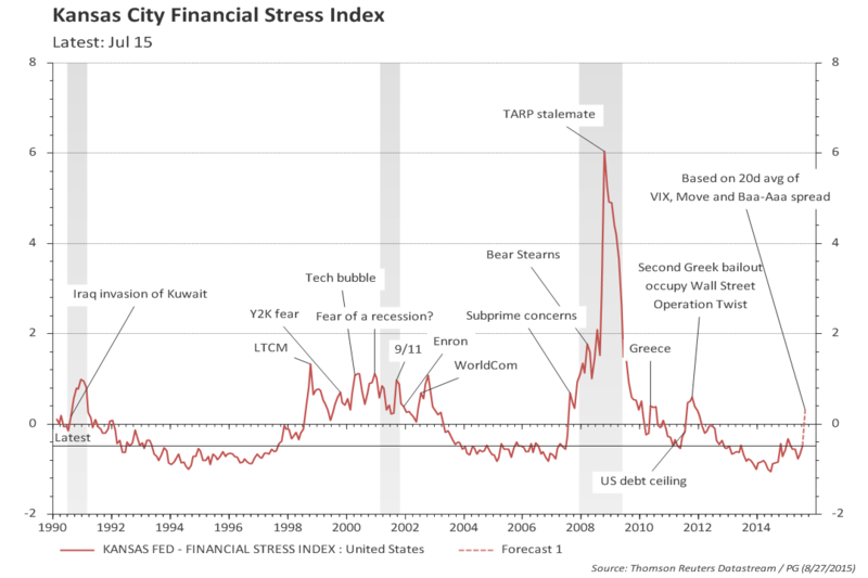
  • The median financial shock is similar to LTCM, WorldCom, 9/11 -- the current one does not feel as bad; however, the financial variables (volatility, spreads, etc.) are behaving as if it was.
  • Taking at face value (and assuming the level of stress in the mkt continues), the current episode would be worse than the median financial shock (current episode means prices of last Wednesday).
  • Note: the above simulations do not consider the impact of lower oil prices:
    • First quarter growth hinted at a negative effect, as investment in the oil sector collapsed and the consumer did not pick up the tab.
    • However, most of the hit on investment is behind (rigs counts turned positive by mid-July and have kept that way until end of Aug).
    • More analysis is needed.


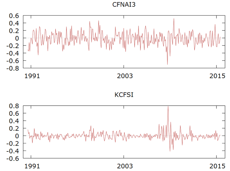
One useful index to measure financial conditions is the Kansas City Financial Stress index (KCFSI) -- see Financial Conditions and Financial Stress: Starting with Kansas City (KCFSI).

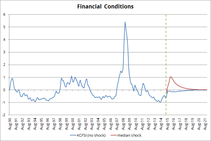
The KCFSI is calculated to have zero mean and 1 standard deviation. It has not yet been updated for the month of August, but based on measures of VIX, MOVE, and Baa-Aaa spread, one can infer the last 20d average at 0.3 (i.e., 0.3 standard deviation). Based only on August 26 data, the KCFSI would be closer to or slightly above one standard deviation -- a level reached during the crisis of late 1998 to 2002 period (LTCM, 9/11, WorldCom, etc.)

One useful measure of economic activity / growth is the Chicago Fed National Activity Index (CFNAI) - see Filtering US GDP noise using CFNAI.


How can one infer the size of a financial shock from the KCFSI (or from any other FCI or FSI)?
One could argue that if the KCFCI moved from, say, -0.2 in a given month (t=0) to 0.3 in the following month (t=1), then there was a financial shock of around 0.5 standard deviation. However, this is not accurate since the time series for the index has a large degree of persistence (memory). As a matter of fact, there is a high likelihood that the financial conditions index would increase further in t=2, and it would not be appropriate to attribute the increase in t=2 to a new financial shock -- it would be considered a follow through from the shock that had occurred in t=0.

What about the size of a shock to real economic activity?
A similar reasoning would apply. Moreover, it would also be important to disentangle the shock to economic activity coming from the financial shock and the one coming from the real shock.

So, what should one do?
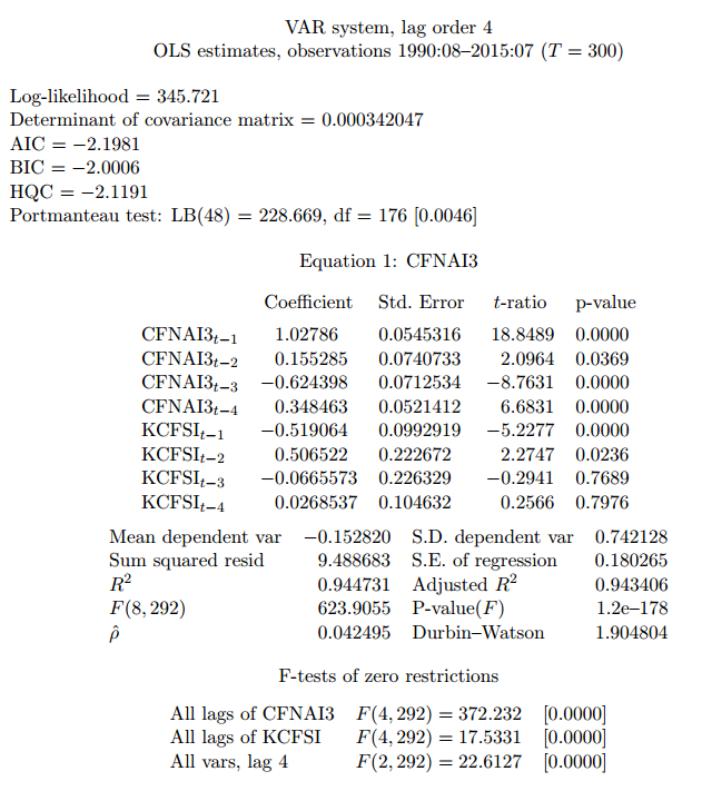
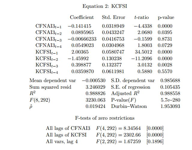
A simple alternative is to estimate a VAR model (vector autoregression). Doing that (after checking for the appropriated lags, for the stationarity of residuals, for autocorrelation in the residuals, etc.) I obtain:


VAR model

The residuals from the VAR are the actual (real and financial) shocks. They are clearly stationary and close to being white-noise.


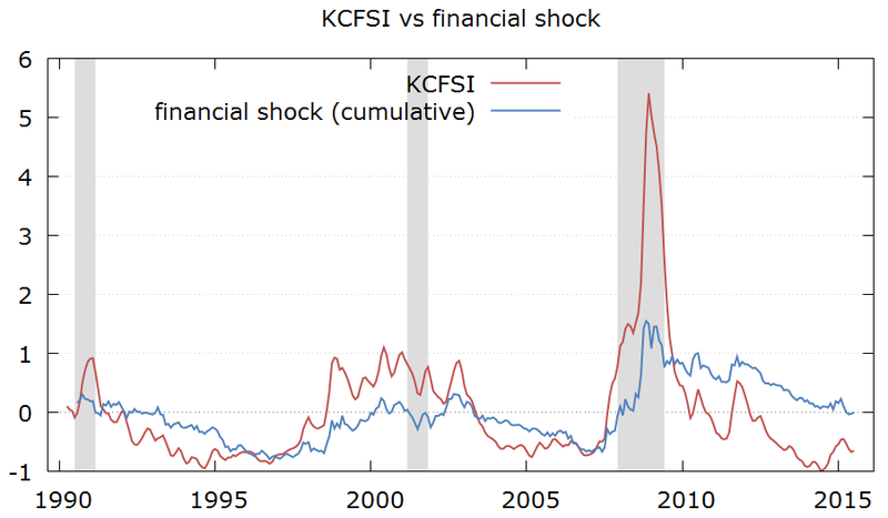
In order to better understand the dynamics of the financial shocks, I will add the residuals cumulatively. In that way, a sequence of positive residuals (shocks) will not cancel out and will show as an increase in the cumulative financial shock hitting the economy.

The chart below makes this point clear: the KCFSI measures the level of financial conditions / stress, while the cumulative financial shock measures the cumulative effects of the new financial shocks into the economy. Both series are similar, but there are some interesting differences. For instance, in the period from 2004 to 2007 the KCFSI remained relatively stable, while the cumulative financial shock was trending down, showing that the economy had been consistently hit by positive new financial shocks.


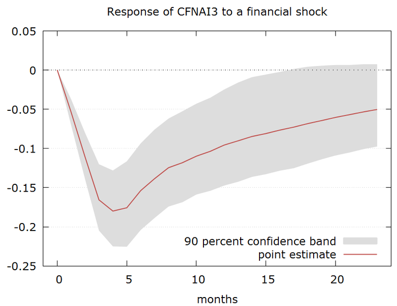
The standard deviation of the financial shock is around 0.1 -- and the chart below shows the impact of a one standard deviation financial shock into the economic activity (as measured by the CFNAI): it has a peak impact of around 3 to 5 months and reduces the CFNAI by 0.18 (from the baseline of no shock) in this period.

The rule of thumb to translate CFNAI to GDP is each 0.1 in CFNAI is equivalent to 0.25pp in underlying growth. Therefore the impact of a one standard deviation shock in financial conditions to growth would be to cut growth by around -0.5pp 3 to 5 months down the road.

In the sample period from 1990 only 10% of the financial shocks were above 0.10 -- so the above calculation is representative of a really bad outcome.


However, there is often periods where the financial shocks happen in sequence. In order to see that one can look at periods where the cumulative financial shock is increasing. There are a few of these periods since 1990.
A more realistic scenario, perhaps, would be to replicate the previous cycles of a sequence of financial shocks.

There are 6 episodes where the cumulative financial shock over a 6-month period reached above 0.4: Feb/99, May/00, Sep/02, Jan/08, Dec/08, and Oct/11.

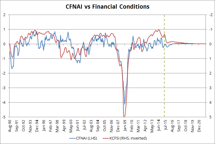
In the absence of shocks, both the CFNAI and the financial conditions KCFSI will converge to their equilibria in the long run, as shown in the chart below (zero CFNAI is equivalent to GDP growing at 2.5%):


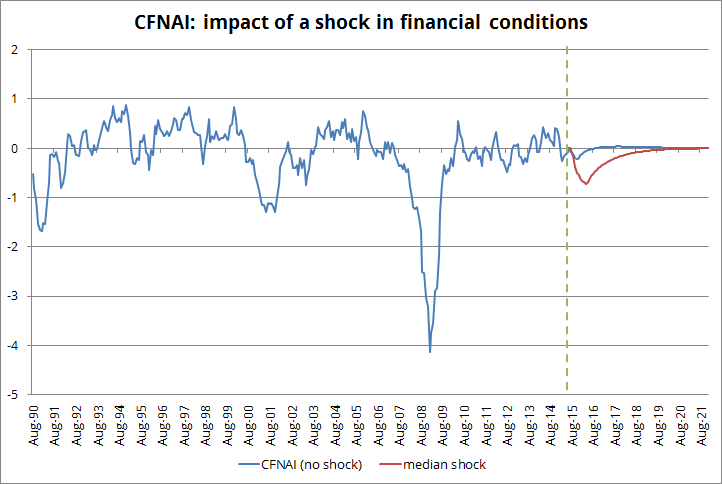
If I assume no shock on the real economy (no shock to CFNAI) and a median shock for financial conditions (median from the above mentioned episodes) it results in the following:

a) a hit to financial conditions similar to the ones observed in the 1998-2002 period.

b) CFNAI dropping to -0.7; this would be equivalent to GDP growing at 0.7% by early 2016.


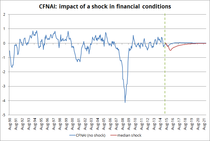
An alternative simulation would consider likely shocks to real economic activity (CFNAI) instead of assuming them zero. Using the shocks to CFNAI that happened at the same time than the shocks to financial conditions would allow for a possible association among the shocks (even though, for the full sample, there is no correlation between the shocks).

This would not change the shock to KCFSI since the model does not capture a meaningful feedback from real activity to financial shocks. However, by incorporating shocks to real activity it changes a bit the path for CFNAI.

As the chart below shows, considering shocks to real activity reduces the impact of the financial shock: the CFNAI drops to -0.5 (instead of -0.7) and this imply GDP slowing to around 1.2% early next year.


But what about the oil shock? Is it positive or negative?

This question cannot be answered based on the simplified VAR model above. Late last year a case was made that the negative impact of the strong dollar would/could be offset by a positive impact of lower oil prices. However, the first quarter came, the consumer extra income (saved from energy) did not show up, investment in the oil sector collapsed and, to make things worse, the weather and the West Coast port strike took a hit in the economy.

Now we can be facing again a similar trade-off: would falling oil prices make up for the renewed strength in the dollar and the negative shock to financial conditions? Results from the first quarter could make one skeptical; on the other hand, one can argue that most of the hit to oil investment has already happened and that the more recent drop in prices would not make things a lot worse (indeed, weekly rigs counts turned positive mid-July and kept that way until the end of August).

The Goldman Sachs has a version of its financial conditions index that includes oil prices and the trade-weighted dollar. I will next repeat the above analysis using the GS index to check if it makes a difference.


Paulo Gustavo Grahl, CFA

Random comments on macro data. Views are my own. Except when they aren't.