Showing all posts tagged #research:


US FOMC digest: risk management

Posted on December 17th, 2015

Main takeaways:
  • Dovish hike delivered; the gradual base case is 100bp/year, but market is not convinced; Fed emphasizes policy remains accommodative.
  • Key reason for moving (when inflation is still low): monetary policy has lags; a delay increases risk of abruptly tightening later.
  • Reference to actual inflation and that inflation expectations have to be well anchored probably helped to bring the doves on board.
  • However, the hurdle for inflation is not very demanding -- underlying PCE momentum is running in the 1.2%-1.5% range and the Fed central tendency forecasts for 2016 is 1.2%-1.7%.
  • Fed expects neutral fed funds (r*) to raise only gradually; markets, on the other hand, are betting on a secular stagnation type of story -- r* remains zero for the next two years and monetary policy stance remains even more accommodative than today.


FOMC
Comments
Policy decision
Raise the target range for the federal funds rate to 1/4 to 1/2 percent. Monetary policy remains accommodative.
Reinvestment policy will continue until "normalization of the level of the federal funds rate is well under way" -- this should "reduce the risk that fed funds rate might return to the effective lower bound in the event of future adverse shocks".
Why?
"Considerable progress that has been made toward restoring jobs, raising incomes, and easing the economic hardship of millions of Americans", and reflects "confidence that the economy will continue to strengthen". The recovery, however "is not yet complete": there's room for labor market to improve further and inflation continues to run below 2%. So why increase rates?
a) softness in inflation is due to transitory factors that should abate over time;
b) diminishing slack should put upward pressure on inflation as well;
c) it takes time for monetary policy actions to affect future economic outcomes;
d) a delay of normalization (for too long) increases risk of abruptly tightening policy at some point to avoid overshooting the goals.

Risks
Risks are balanced.
Policy outlook
In "determining the timing and size of future adjustments", FOMC "will carefully monitor actual and expected progress toward our inflation goal". Also, FOMC confidence in the inflation outlook rests importantly on its judgment that longer-run inflation expectations remain well anchored.
Normalization process likely to proceed gradually. This is consistent with the view that neutral nominal fed funds rate (r*) is currently low by historical standards.
FOMC expects that with "gradual adjustments in the stance of monetary policy" economic activity will continue to expand at a moderate pace and labor market indicators will continue to strenghten -- by how much? look at forecasts.

Discussion on equilibrium / neutral fed funds rate (r*)
The FOMC expects federal funds rate to remain, for some time, below levels that are consistent with its longer run assessment. The key rational behind this idea is that for that is the neutral rate (r*) is currently low and will only move gradually towards its long term level.

Why is r* low?
Because of the headwinds: tighter underwriting standards, limited access to credit, deleveraging, contractionary fiscal policy, weak growth abroad, significant appreciation of the dollar, slower productivity and labor force growth, elevated uncertainty about economic outlook.
These have declined noticeably over the past few years, but some have remained significant. As these abate, r* should gradually move higher over time -- this can be seen in the SEP.

How do you know for sure that r* is low?
One indication is that growth has been only moderate despite very low level of funds rate and the large balance sheet. Had r* been higher, economic expansion would have been much more rapid.

How low?
During the October FOMC meeting the staff briefed participants about the topic and the conclusion leaned towards:
  • r* was negative in the aftermath of the 2008-09 financial crisis and is currently close to zero.
  • Equilibrium level of r* would likely remain low relative to estimates before the financial crisis (due to productivity and demographic factors). This is reflected in SEP's forecast of 1.5% real rate in the long run (below the 2% used in the past).

According to the Taylor rule mentioned by Yellen (Yellen's preferred Taylor rule) on her remarks earlier this year (Normalizing Monetary Policy), even considering r*=0 (the green line in the chart below) the Fed would already be behind the schedule. An r*=0 (and current readings on PCE inflation and unemployment rate) would imply fed funds approximately 50bp higher -- this is why the Fed calls the monetary policy stance accommodative (below the neutral).

The fact that the slope of the 'dots' curve is higher than the green line reflects the idea of r* gradually moving higher over time. Market forecasts, on the other hand, are betting on a secular stagnation type of story -- r* remains zero for the next two years and monetary policy stance remains a bit more accommodative as it is today (a bit more than 50bp below the r*=0 line).


Emphasis on actual inflation
The newly introduced actual in the sentence "the Committee will carefully monitor actual and expected progress toward our inflation goal" was probably key to bring the doves on board (the other was the reference to the reinvestment policy, which would continue until "normalization of the level of the federal funds rate is well under way" -- this probably helped to please Brainard).

However, the Committee was smart enough to leave this comment flexible enough to avoid tyeing the Fed to a given path of inflation. Chair Yellen ably avoided giving any hard target when questioned by reporters. They avoided the historical mistake of the 6.5% unemployment target...

"Now, I've tried to explain in many of my -- and many of my colleagues have as well why we have reasonable confidence that inflation will move up over time, and the committee declared it had reasonable confidence. Nevertheless, that is a forecast. We really need to monitor over time actual inflation performance to make sure that it is conforming, it is evolving, in the manner that we expect. So it doesn't mean that we need to see inflation reach 2 percent before moving again, but we have expectations for how inflation will behave, and were we to find that the underlying theory is not bearing out, that it is not behaving in the manner that we expect, and that it doesn't look like the shortfall is transitory and disappearing with tighter labor markets, that would certainly give us pause. And we have indicated that we are reasonably close, not quite there, but reasonably close to achieving our maximum employment objective. But we have a significant shortfall on inflation. So we are calling attention to the importance of verifying that things evolve in line with our forecasts."

"I'm not going to give you a simple formula for what we need to see on the inflation front, in order to raise rates again. We will also be looking at the path of employment as well as the path for inflation. But if incoming data were, led us to call into question the inflation forecast that we have set out, and that could be a variety of different kinds of evidence, that would certainly give the committee pause. But I don't want to say there is a simple benchmark. The committee expects inflation over the next year at the median expectation is for inflation to be running about 1.6 percent. And both core and headline, so we do expects it to be moving up, but we don't expect it to reach 2 percent."

The chart below gives a good picture of recent inflation performance. Both headline and core inflation were increasing at the same pace (about 1.5%) from late 2011 to mid 2014, when oil prices were roughly flat. From October 2014 to January headline inflation dropped 0.8% (-3.4% annualized) reflecting the drop in energy prices, and has increased 1.1% until last October (about 1.4% annualized). This late rebound is headline prices is roughly in tandem with the pace of core inflation.

Core CPI inflation momentum is already running 2.4% (details here) but the gap with PCE inflation has opened and core PCE momentum is in the 1.2%-1.5% range. The Fed expects PCE inflation in the 1.2% to 1.7% range in 2016 (central tendency) so the bar is not very high.
However, further decline in oil prices and/or strengthening of the dollar could easily delay Fed action.


FOMC reference scenario
The table below is a reference to the FOMC base case, which is compatible with "gradual adjustments in the stance of monetary policy" -- i.e., 100bp/year.
The evolution of the actual economic variables and the evolution of Fed's forecasts will tell whether the economy is ahead or behind the base case.


Chart 1) Evolution of Fed forecasts for unemployment and inflation
Unemployment rate
PCE inflation


Chart 2) Dots and the implied Taylor rule

Taylor rule
Fed funds in 2015 below the r*=0 Taylor rule -- meaning monetary policy stance is accommodative
Dots for 2016 still imply a accommodative policy stance -- even assuming r* remains at zero!
Dots for 2017 moved down, suggesting the Fed sees headwinds taking longer to abate.


US financial conditions and commodity prices ahead of the historical FOMC tomorrow

Posted on December 15th, 2015

Main takeaways:
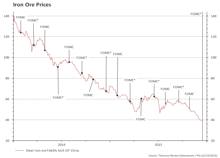
  • Commodities (including oil) breaking new lows.
  • Strong USD.
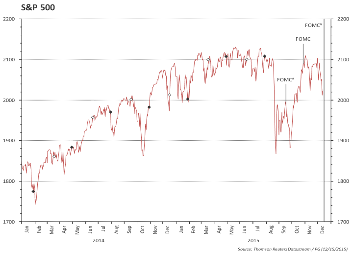
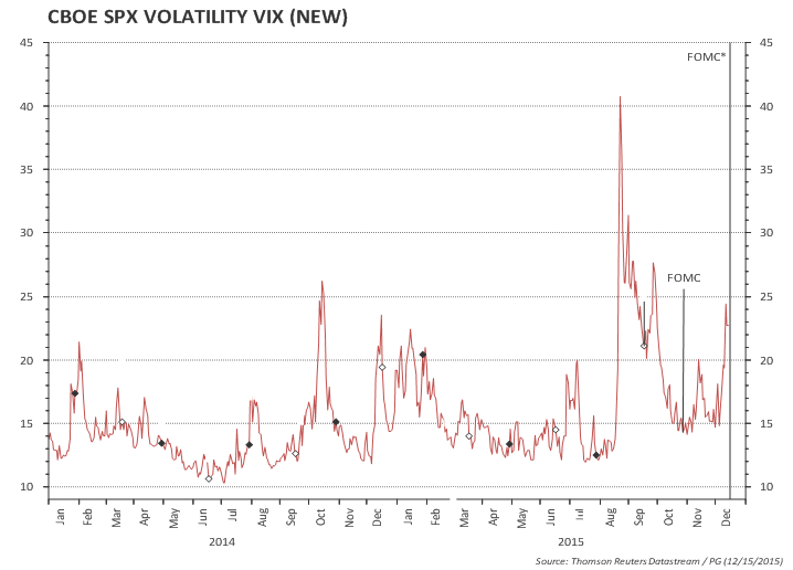
  • Equities off the highs with increasing vol.
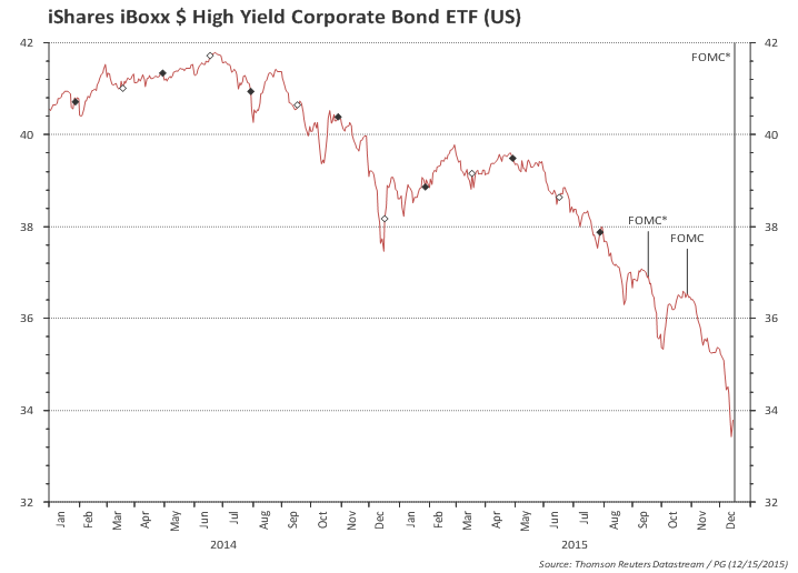
  • Baa - Aaa spreads widening. High yield mkt close to panic.
  • But overall financial conditions are off the highs observed earlier in the year.

Charts

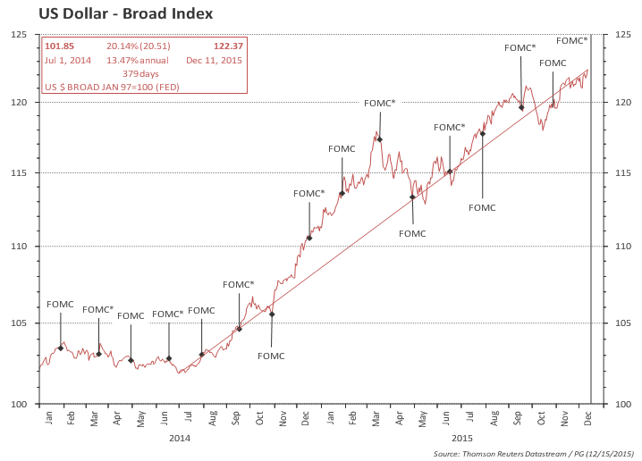
US trade-weighted dollar is higher than earlier in the year, when Fed warned about its negative consequences to the economy.

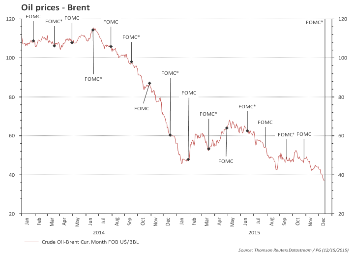
Oil prices are also at the lows.

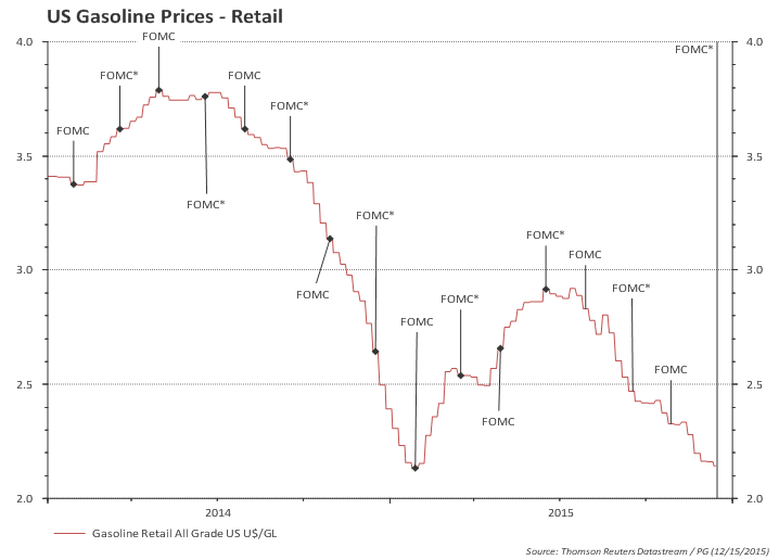
Retail gasoline prices are close to the lows.

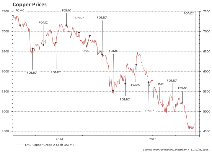
Commodity prices also at the lows.

US equities recovered part of its Aug/Sep losses, but face renewed uncertainty.

Equity vol is high again.


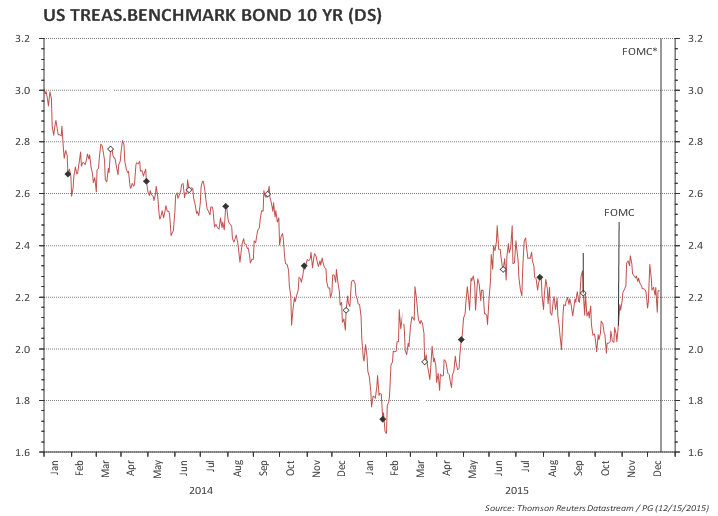
US 10y Treasuries

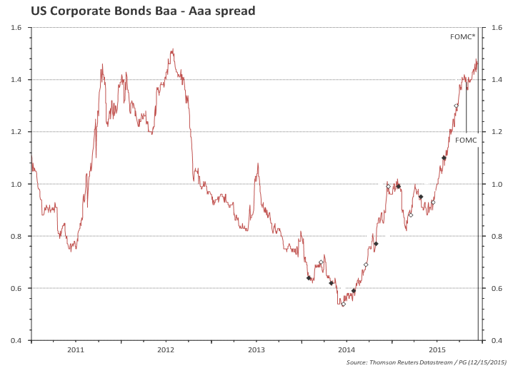
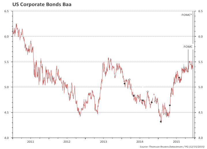
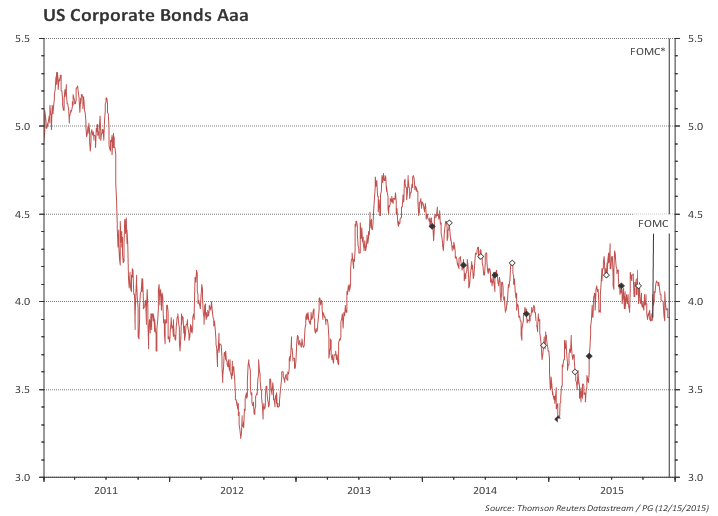
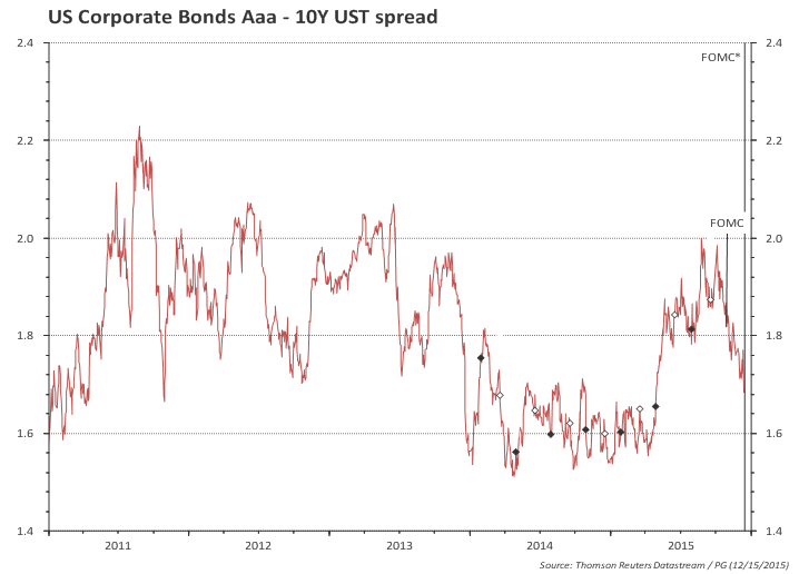
Baa spreads widened


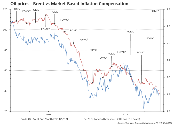
Market-based inflation compensation sharply down, but this could just be oil prices

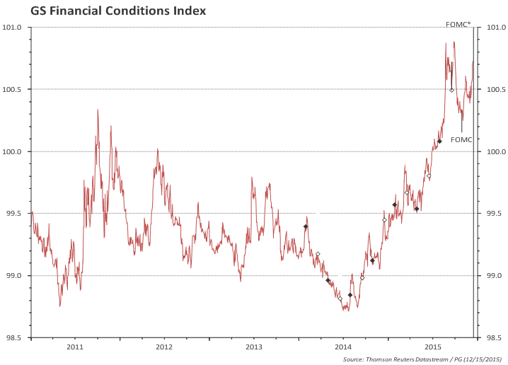
Financial conditions, as measured by GS, are tighter than in the last few years.

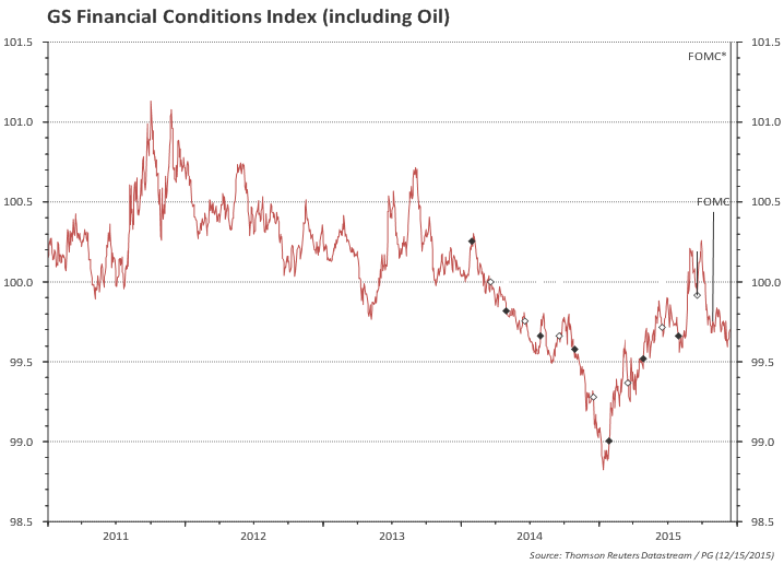
...but broadening the definition to include oil prices show a more benign picture

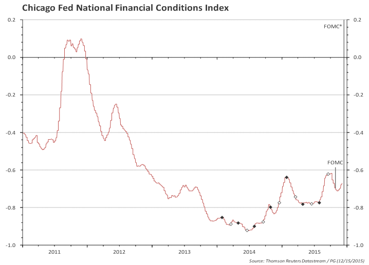
Financial conditions, as measured by the Chicago Fed, also show a tightening, but overall levels remain in the accommodative range

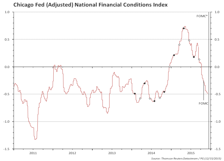
Adjusting for the business cycle, Chicago Fed index suggest that financial conditions moved to tight earlier in 2015 and are now back to easy.

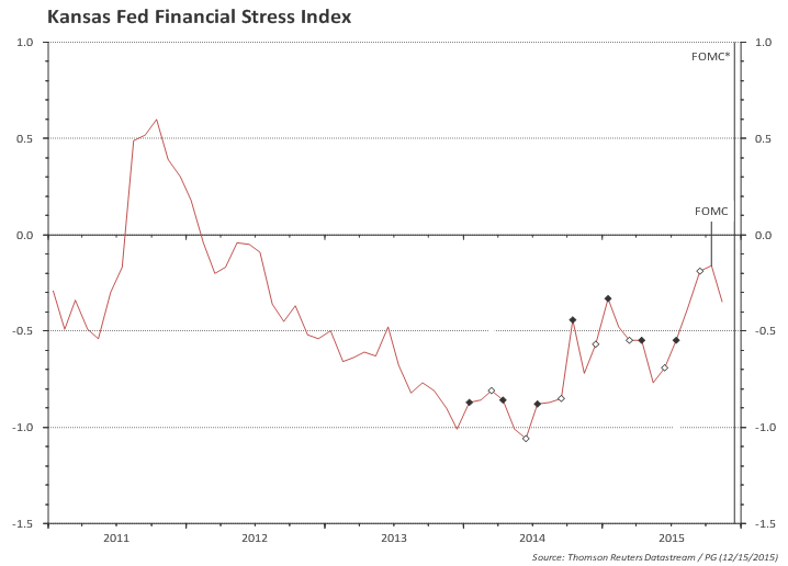
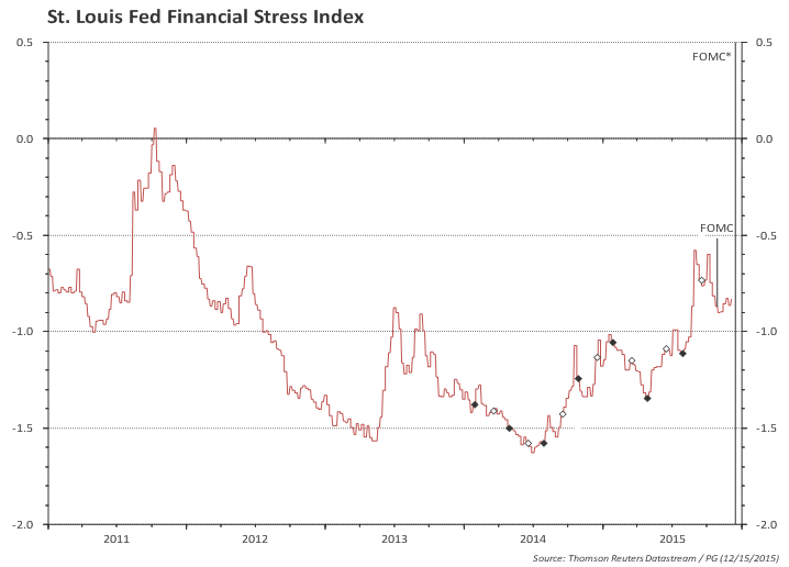
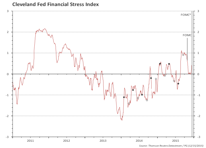
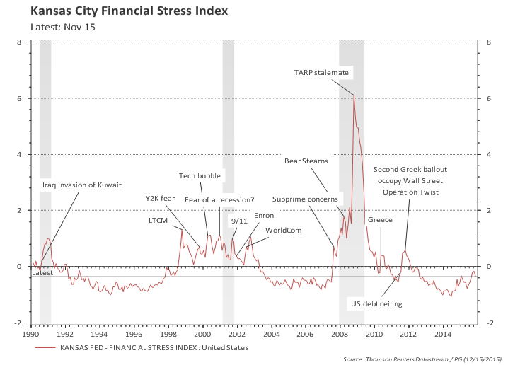
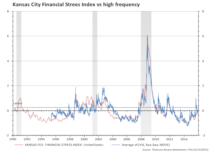
Below, some additional financial conditions and financial stress indices

Longer history of financial conditions and the relevant episodes.


US Inflation: enough to remain confident? (Nov/2015)

Posted on December 15th, 2015

Main takeaway:
  • Core CPI inflation momentum rose to 2.4% (annualized).
  • Core services inflation increased from 2.5% yoy in June to 2.9% yoy in November. Core goods are down 0.6% yoy.
  • Sticky-price CPI (a sign of anchored expectations) is trending up.
  • Interestingly, core inflation is unabated despite the strong dollar.
  • Headline inflation will likely move up in the next couple of months due to base effect.

Fed's criteria for raising rates:

"The Committee anticipates that it will be appropriate to raise the target range for the federal funds rate when it has seen further improvement in the labor market and is reasonably confident that inflation will move back to its 2 percent objective over the medium term."

Given the expected hike tomorrow, the Fed is reasonably confident inflation will move back to 2%.
The focus, then, is likely to move toward the criteria the Fed will use to justify the second rate hike.

The chart below shows CPI in the last 6 years. Headline CPI was growing close to the underlying core CPI in a period where oil prices were roughly flat, butMarket forecasts, on the other hand, are betting on a secular stagnation type of story -- r* remains zero for the next two years and monetary policy stance remai
the gap opened from mid-2014 onwards with the sharp drop in oil prices. It is interesting also to note that the strong US dollar has barely dented the trend in core inflation.

The chart also shows that headline yoy inflation is likely to increase in the next couple -- unless the drop in oil prices is big enough to offset the drop in inflation observed in Nov/14-Jan/15 period. Even if headline inflation remains flat in the next couple of months, the yoy figure will increase from the current 0.4% to 1.4% in January.


Today's CPI print showed another increase in core inflation momentum (3-month annualized inflation). Core inflation momentum moved from 2.2% to 2.4%:

Average YoY measure of core inflation is currently at 2.1% -- the most recent low was 1.8% in May, but overall core inflation has been stable at around 2% since mid-2012.

But behind slight increase in YoY core inflation there's a growing divergence. Core goods are 0.6% lower than a year ago while core services are 2.9% higher.

Note how the pace of increase in core services prices increased in the last few months! It is very close to the average 3% inflation observed during 2002-2008 period.

Housing prices (rental and OER) represents 33% of CPI and is increasing at 3.2% yoy.


Sticky-Price CPI (a sign of anchored expectations) is trending up

The Atlanta Fed produces a breakdown between 'sticky' vs 'flexible' prices and they argue 'sticky' prices (which is a weighted basket of items that change prices relatively slowly) "appear to incorporate expectations about future inflation to a greater degree than flexible prices".


Overall prices, outside of energy group, do not seem to have bent to low oil prices and strong dollar.


Market-based inflation expectations and compensation


US Retail Sales -- excluding gasoline, retail sales are growing at a healthy 4.4%

Posted on December 11th, 2015

Main takeaways:
  • November: advance retail sales rose 0.2%mom, below 0.3% market consensus; control group increased 0.6%mom above 0.4% consensus.
  • Trend growth remains unchanged:
    • 12-month growth of total retail sales ex gasoline stations increased from 4.3% to 4.4%.
    • 12-month growth of the 'control group' rose from 3.1% to 3.4%.
    • Both are very close to the 4-year growth pace: a resilient consumer!
    • Recall that retail prices are close to flat -- so the above growth rates are close to volume growth!
  • Inventory-to-sales ratio remained roughly flat (excluding gasoline).

The overall trend for retail sales remains unchanged. Excluding sales at gas stations the trend growth is healthy: 4.4% in the last year compared to 4.5% in the last 4 years (in nominal terms).

The chart below compares total retail sales with retail excluding gasoline sales. It is clear that most of the slowdown in retail sales in the last few months was due to falling gasoline prices (similar to what has happened earlier in the year).

Looking at the "control group" (total retail excluding auto dealers, bldg materials, gas stations) a similar growth picture emerges: 3.4% growth in the last year and 3.0% in the last 4 years.

Excluding residual sales of gasoline from the control group reveals a 1pp growth gap.

Also, it is important to recall that (control group) retail prices have been trending down in the last year...

...which results in a very healthy 3.6% growth rate in retail volumes.


Inventories: stable if one excludes gasoline sales (latest: October)


Extra charts

The charts below show retail and food services by kind of business. The red line is an index in log (averages zero in the period) so that a number 10 in the scale means sales are 10% higher than the period average. The red dashed line is the trend in the last 12 months and the blue bars (right scale) are the monthly percentage change. The headline is how the slope of the red dashed line has changed compared to last two months.


Last 12 months trend moved from 6.1% (Aug) to 6.7% to 6.4%


Last 12 months trend moved from 5.0% (Aug) to 5.5% to 5.8%


Last 12 months trend from -4.6% (Aug) to -3.8% to -1.8%


Last 12 months trend moved from 1.7% (Aug) to 3.4% to 3.0%


Last 12 months trend moved from 2.7% (Aug) to 1.9% to 1.8%


Last 12 months trend moved from 3.4% (Aug) to 4.0% to 3.8%


Last 12 months trend moved from -19.2% (Aug) to -14.2% to -11.6%


Last 12 months trend moved from 3.6% (Aug) to 2.6% to 1.8%


Last 12 months trend moved from 5.6% (Aug) to 6.0% to 7.0%


Last 12 months trend from 0.8% (Aug) to 2.0% to 2.9%


Last 12 months trend moved from 4.8% (Aug) to 3.9% to 2.9%


Last 12 months trend moved from 6.7% (Aug) to 6.7% to 7.2%


Last 12 months trend from 7.4% (Aug) to 5.6% to 5.9%

US External Trade: Net exports likely to be a drag again in Q4 (Oct/15)

Posted on December 4th, 2015

Main takeaways:
  • Net exports likely to be a drag on growth again.
  • US exports are not losing market share, despite dollar strengthening that started mid-2014.
  • Weak US exports more likely reflect sluggish global trade.


Trade results for October, if repeated in the next couple of months, would lead to a material drag in Q4 growth again. Note, however, that periods of consistent drag from net exports were also observed in the 1997-2005 period -- see chart.

Imports are growing at a strong pace and exports collapsed in the turn of the year and remained roughly flat since then.

The jump in import growth precedes the stronger USD and coincides with an upturns in job creation and consumption that happened in 2014 -- therefore not likely to be a strong consequence of the currency strength and import substitution (although it may play some role).
The slowdown in exports, however, happened at the turn of the year, and therefore could potentially be a quick response to the strenghtening of the dollar that started in mid-2014.

However, the chart below shows that US exports are moving roughly in tandem with world exports...yes US exports relative to world exports dropped since the start of 2015, but the relative level is only 1.5% below the trend since the crisis. This means that the recent strengthening of the dollar is not causing a loss of US market share in world (volume) exports.
Of course it could be just a matter of time for US exports to shrink relative to world exports, but the recent weak performance seems more likely a result of sluggish world trade rather than dollar strength.

Meanwhile, the ISM export orders do not suggest any upside in the near term.


US November employment by category

Posted on December 4th, 2015

November employment by category

The charts below show employment by category. The blue line is total employment in the category, the orange bar is monthly change and the red line is the linear regression in the last two years.

Total payroll increased 211k in November, after a 298k growth in October (which was revised up from 271k). The trend for the last 6 months slowed from 280k/month by the end of last year to 213k in the 6 months to November.

Private payroll increased 197k in November, after 304k growth in October (revised up from 268k). The trend for the last 6 months slowed from 270k/month by the end of last year to 201k in the 6 months to November.

Most of the slowdown in the pace of job creation was concentrated in the goods producing sector (mining and manufacturing); construction jobs are doing ok and the the services sector has, so far, not being affected by manufacturing slowdown. Overall, the 6-month pace of job creation in the goods sector slowed from 50k (at the end of last year) to close to zero, while in the services sector it slowed from 220k to 194k in the same comparison.

Employment categories

  • Total nonfarm
    • Total private
      • Goods-producing
        • Mining and logging
        • Construction
        • Manufacturing
      • Private service-providing
        • Trade, transportation, and utilities
          • Wholesale trade
          • Retail trade
          • Transportation and warehousing
          • Utilities
        • Information
        • Financial activities
        • Professional and business services
          • Temporary help services
        • Education and health services
          • Educational services
          • Health care and social assistance
        • Leisure and hospitality
        • Other services
    • Government

Charts

Total nonfarm (trend from 242.7 to 242.1 to 241.7/m)

Total private (trend from 235.6 to 235.0 to 234.5/m)

Goods-producing (trend from 34.8 to 32.4 to 30.4/m)

Mining and logging (trend from -1.1 to -1.5 to -2.0/m)

Construction (trend from 22.4 to 21.8 to 21.7/m)

Manufacturing (trend from 14.1 to 13.0 to 12.0/m)

Private service-providing (trend from 200.8 to 202.6 to 204.1/m)

Wholesale trade (trend from 7.9 to 7.8 to 7.5/m)

Retail trade (trend from 24.0 to 23.9 to 24.2/m)

Transportation and warehousing (trend from 12.4 to 12.1 to 11.4/m)

Utilities (trend from 0.7 to 0.7 to 0.8/m)

Information (trend from 3.9 to 3.8 to 3.9/m)

Financial activities (trend from 11.6 to 11.8 to 12.2/m)

Professional and business services (trend from 53.7 to 54.2 to 54.4/m)

Temporary help services (trend from 11.9 to 11.7 to 11.2/m)

Educational services (trend from 4.2 to 4.1 to 4.4/m)

Health care and social assistance (trend from 39.1 to 40.9 to 42.3/m)

Leisure and hospitality (trend from 37.1 to 37.1 to 37.3/m)

Other services (trend from 6.2 to 6.1 to 5.8/m)

Government (trend from 7.0 to 7.1 to 7.2/m)


Dr. Paulo Gustavo Grahl, CFA (2015-12-04)


US November Payroll: changing the focus to the pace of rate increases...

Posted on December 4th, 2015

Main takeaways:

  • Yellen's speech at the Economic Club of Washington on Dec 2 explained why she will vote for an increase in rates on December 16. There's nothing in today's job report that would make her change her mind.
  • A couple of months ago I took the view Aug/Sept plunge in job creation would reverse in time for a December liftoff: "Since I believe the payroll slowdown is temporary and that global risks are likely to recede in the coming months, I think December is still the most likely date for moving out of the ZLB". That's now a consensus.
  • The focus will now shift to the pace of increase thereafter, as the Fed wishes:
    • "what matters for economic outlook are the public's expectations concerning the path of the federal funds rate over time" (Yellen speech).
  • But FOMC expected, in September's projections, around 100bp increase / year in the next couple of years; market expects, on average, around 50-60bp per year. The FOMC could move a bit towards markets in the next meeting, but the gap will remain large.
  • The risk of a very short hiking cycle is not trivial; but, barring a China colapse, I think odds are both the Fed and the markets will adjust expectations upwards by mid H1 2016.

Establishment report:

Private payroll increased 197k in November, in line with the bloomberg consensus. Net revisions were positive 52k.

The table below shows the expected range for private payroll (excluding outliers), the monthly surprise and revisions to the last 3 months. The actual print is in "red" (an "x" when inside the expected range and a box when outside).

It is interesting to see the shape of the gray area! The negative surprises in August and September led to a material downward change in market's expected range for private payroll. A positive surprise in October resulted in an opposite move.


Market has been on track forecasting the pace of job creation in the last 6 months!
(but actual number beat forecast in the last 3 months)
One can see that the average of the median expectations for the last 12 months was 212k/month, very close to the actual releases of 213k/month in the same period (after revisions, private payroll averaged 212k/month in the last 12 months).

In the last 6 months the median expectations averaged 201k/months and the actual release averaged 193k (201k/month after revisions).

In the last 3 months the median expectations averaged 188k/m and the actual release averaged 194k/month (222k/month after revisions).

Payroll trend
The trend in private payroll (measured by the 12-month moving average) moved down to 212k/month from 226k/month (unrevised) in October. The chart below shows the current vintage (orange line) as well as the real time path observed in each of the last few months.

It is clear that the pace of job creation has slowed from the excessively high pace observed in Q4 2014 and Q1 2015, but it is still well above the job growth observed in 2013 / early 2014.


The chart below shows that annual growth rate in private payroll is growing at 2.1% yoy -- off the highs but is still a healthy pace of growth.


Job growth momentum is back to neutral after spending Q2 and Q3 in the negative area.

Labor input:

The volume of total hours worked in the economy recovered from September and is back on the trend since 2009. Total hours worked increased 2.2% (annualized) in the last 3 months (blue line in the chart below).


Hours worked in the goods sector have been roughly flat in 2015. Hours worked in the services sectors continued performing well.


Wages:

Wages for all employees rose by 2.3% yoy (vs 2.4% in October) and for production worker rose 2% yoy (vs 2.2% in October). Overall, as the chart below shows, average hourly earnings have consistently grown at about 2.1% p.a in the last three years.


Household income:

Good. Close to the trend observed in the last three years.


Goods sector nominal income below trend.

Services sector income close to trend.


Household report:

The labor force participation rate ticked up in November (to 62.5% -- see chart).
It is interesting to highlight that the most LFPR managed to do was to stabilize in 2014 -- a year in which job creation and labor market conditions improved quite substantially. If the LFPR resumes its structural downtrend it could put the Fed in a position where they see labor slack shrinking faster than what they forecast, despite a similar economic growth outlook.

The broader measure of unemployment (U-6), which includes marginally attached, discouraged workers, and employed part time for economic reasons move slightly up in November, but overall it is falling faster than the headline unemployment.

The median forecast for unemployment rate in the Fed's SEP (Summary of Economic Projections) is 4.8% for 2016, 2017 and 2018. Assuming a flat LFPR, a forecast of 4.8% unemployment rate by the end of 2016 is compatible with average employment growth of 145k/month, substantially lower than the current pace of job growth.


As a reference, even a slowdown in employment growth from 2.1% currently to 1.5% yoy (the floor observed since mid-2011 was 1.8% yoy) would be equivalent to monthly employment gains of 178k and this would lead to a 4.4% unemployment rate by the end of 2016. Bottom line: LFPR needs to rebound (or job creation to settle at a very low level) for a 4.8% unemployment forecast to be attainable.

See detailed charts below:


The chart below shows unemployment rate (and short-term unemployment) and the recent tightening cycles (yellow). The short-term unemployment rate is at the lows.

Long term unemployment rate is improving faster. Moreover, the 'shadow' labor (i.e., the gap between U-6 and the headline unemployment rate) is also improving faster in the recent months. This is a clear sign that the labor market continues improving.


US Personal Income and Outlays in October: income growing fast; consumption slowdown due to energy

Posted on November 25th, 2015


Main takeaways:

  • Income and spending trends broadly unchanged when comparing to the previous report.
  • Slowdown in consumption in September/October is due to energy:
    • Consumption of energy goods and services dropped 8.9% (not annualized) since August.
    • Excluding energy, consumption rose 0.6% in the two months (3.8% annualized).
  • Consumption and income seem to have weathered well the spike in financial conditions.
  • Nominal (real) disposable income trend growth in the last 12 months growing at 4.2% (3.4%) and consumption trend growth at 3.7% (2.8%).
  • Core nominal (real) consumption (ex food and energy) growing at 4.5% (3.2%) in the last 12 months.


Personal consumption excluding energy keeps growing...
...in current prices...

...and volumes.

So the slowdown in the previous couple of months is entirely due to energy. This mirrors the conclusion I had when looking only at the narrower retail sales data (US Retail Sales -- trend remains unchanged.

Income and spending (ex energy) are growing at roughly the same pace. But the slower pace of growth in total consumption (including energy) means savings rate is increasing.


Disposable income seems to be in a steady trend, while household consumption rebounded from the lows early in the year and is back to its previous trend growth.

Chart 1a) Income and expenditures, nominal, since 2010


The growth trend in the last 12 months for disposable income rose to 4.2% in October (3.3% in September and 3.1% in June), while the growth trend for consumption moved up to 3.7% (from 3.6% in September and 2.6% in June).

Cart 1b) Income and expenditures, nominal, last 2 years


Chart 2a) Income and expenditures, volume, since 2010


When looking at volumes (constant prices) the trend growth in real disposable income rose to 3.4% in October (from 2.9% in September and 3.2% in July), while real consumption slowed to 2.8% (vs 3% in September and 2.8% in July).

Chart 2b) Income and expenditures, volume, last 2 years


The chart below shows slightly different measures of income. Overall, all measures are growing at or above 5% in the last 6 months!

Chart 3a) Different measures / concepts of household income, since 2010


Chart 3b) Different measures / concepts of household income, last 2 years


The chart below shows that almost all the recent stagnation in consumption was due to 'energy' consumption.

Chart 4a) Household consumption, core vs total, nominal, since 2010


Chart 4b) Household consumption, core vs total, nominal, last 2 years


Chart 4c) Household consumption, core vs total, volumes, since 2010


Chart 4d) Household consumption, core vs total, volumes, last 2 years


Breaking household consumption into goods and services show that the recent soft patch was entirely due to goods consumption -- but take a look in the chart of volumes: it shows goods consumption growing faster than services.

Chart 5a) Goods and services consumption, nominal, since 2010


Chart 5b) Goods and services consumption, volume, since 2010


Digging further into goods consumption it is evident that most of the hit happened in nondurable (which includes gasoline), but when adjusting for prices nondurable goods seem to be back to the previous growth trend.

Chart 6a) Goods consumption (durables and nondurables), nominal, since 2010


Chart 6b) Goods consumption (durables and nondurables), volume, since 2010


Chart below focus only on nondurable goods (volume) to better spot the trends.

Chart 6c) Goods consumption (nondurables), volume, since 2010


World trade volumes remain sluggish

Posted on November 25th, 2015

Main takeaways:

  • World trade volumes rebounded after the slowdown earlier in the year.
  • But volumes are flat compared to last year.

The Netherlands Bureau for Economic Analysis (CPB - Centraal Planbureau) has released world trade volume data for September.

The charts below shows world trade volumes picking up a bit since the first quarter contraction, but the overall message is still of a very sluggish trade.

Chart 1a) Volume of world trade (exports & imports, seasonally adjusted)


Chart 1b) Volume of world trade (seasonally adjusted)


The charts below zoom in to the most recent four years to highlight the behavior of trade volumes at margin. Export trend growth in the last two years slowed from 2.4% to 2.1% (from July to September), while import trend growth slowed from 1.8% to 1.6% in the same comparison.

Chart 2a) Volume of world exports (seasonally adjusted, last 4 years)


Chart 2b) Volume of world imports (seasonally adjusted, last 4 years)


The breakdown by country/region show that export volumes from the Euro Area have been very resilient while export volumes fell in the other regions. Imports have rebounded in most regions in recent months.

Chart 3a) Export volumes by country / region (seasonally adjusted)


Chart 4b) Import volumes by country (seasonally adjusted)


US Corporate Profits -- adjusting for FX valuation (updated with Q3 2015 results)

Posted on November 24th, 2015

Main takeaways:
  • Foreign profits represent 40% of domestic profits for US corporates.
  • Profits increased 1.4% p.a. since 2011.
  • Adjusting for currency valuation, profits increased 2.5% since 2011.
  • Profit growth in the last 4 quarters slowed in both measures: from 3.6% to 0.9% in headline profits and from 5.7% to 4.0% when adjusting for FX.

Foreign profits represent about 40% of domestic profits (for US corporates, based on national accounts data).

The chart below adjusts the portion of the foreign profits for the currency effect (assuming that the currency composition of foreign profits is equivalent to the currency composition of the trade-weighted dollar calculated by the US Fed).
The "adjusted profits" show a slightly higher trend growth since 2011 -- 2.5% vs 1.4%.

Chart below shows the YoY growth of corporate profits with and without FX adjustment.


Paulo Gustavo Grahl, CFA

Random comments on macro data. Views are my own. Except when they aren't.